Cases – Pt 2

Bookbinding

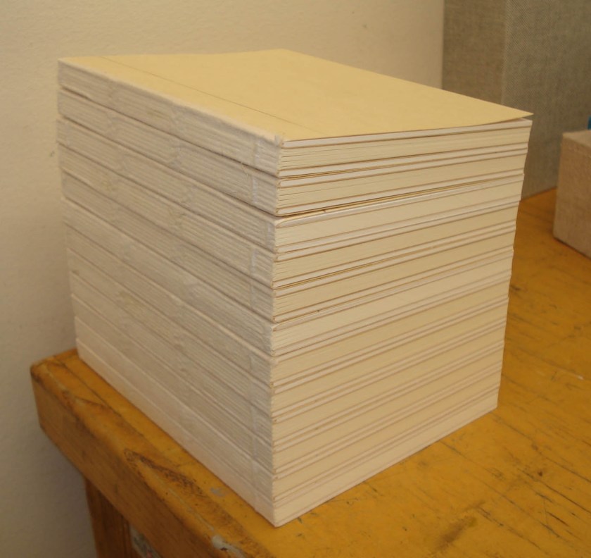
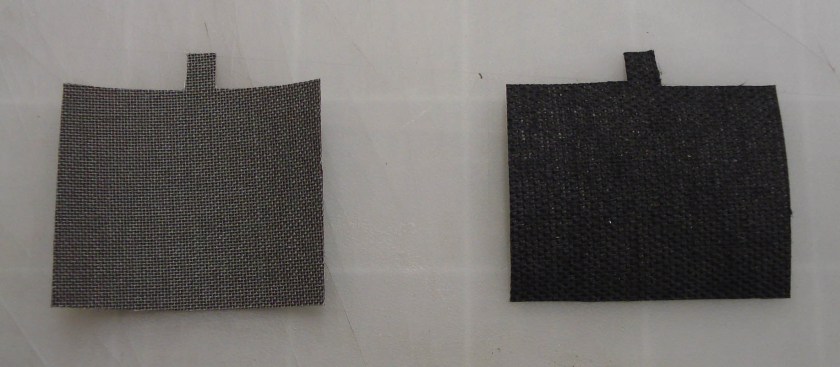
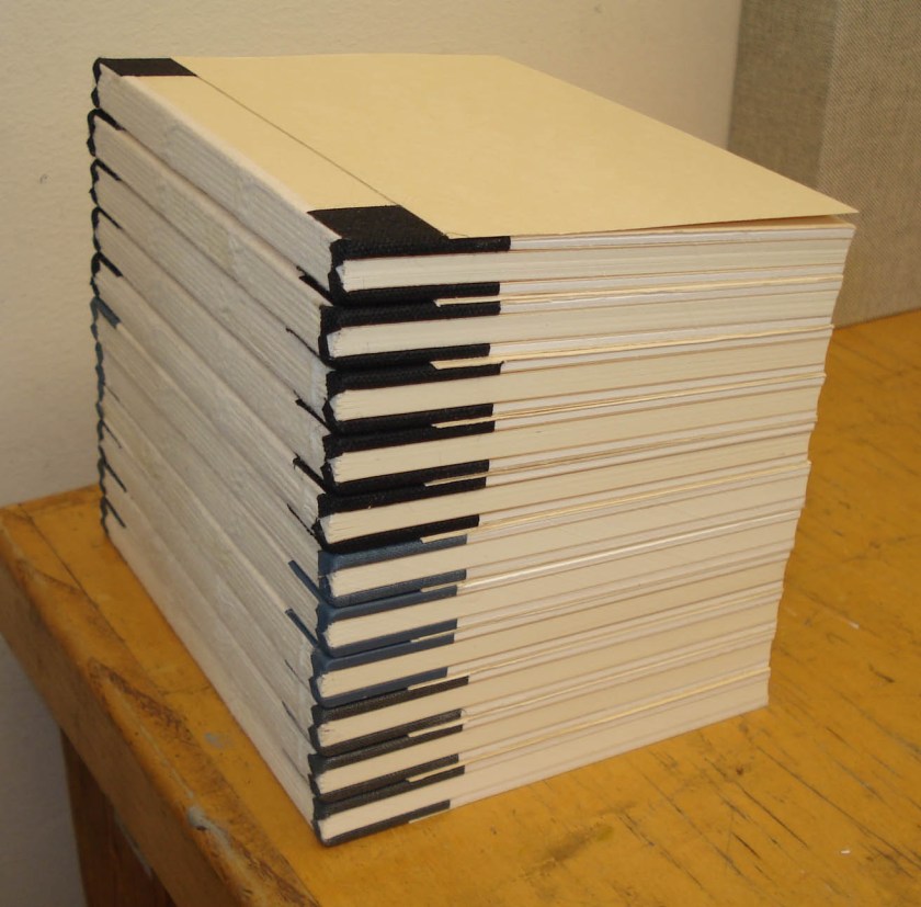
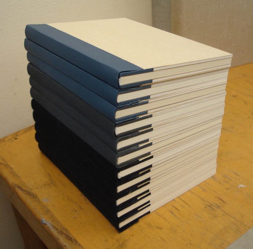
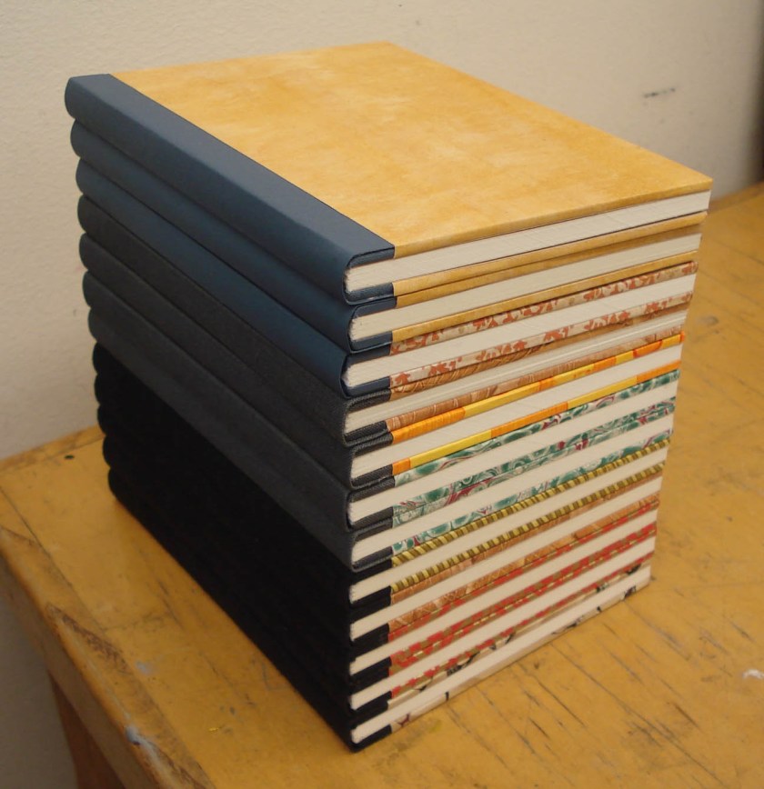
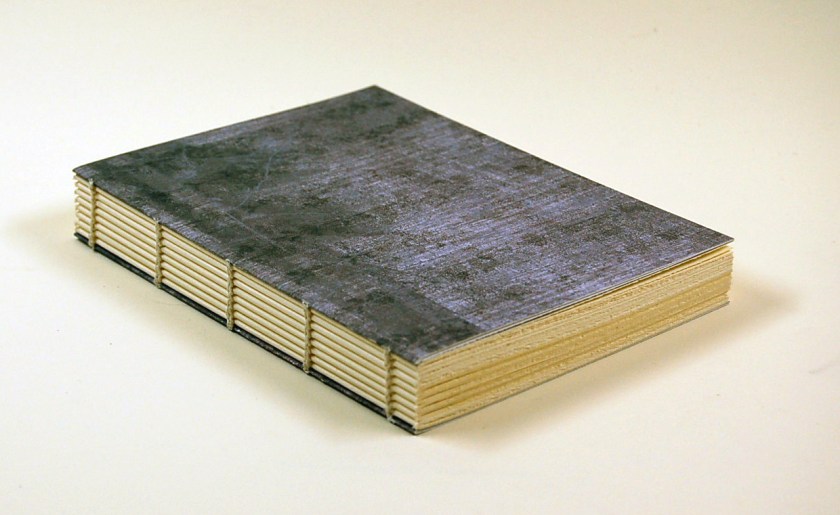
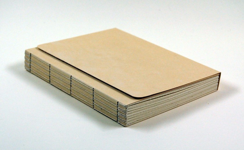
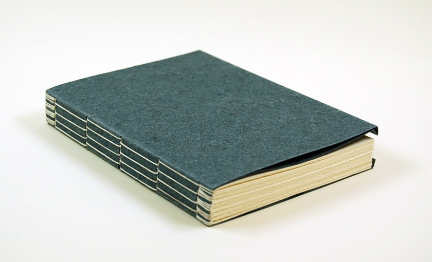
After experimenting with case bindings for a bit, we were assigned to make a set of 12 that had common materials, but variations in covering style, endbands, and endsheet structure. I’ll break the parts of my set down in that order. Once again, certain features, such as book dimensions, textblock paper, and sewing supports remained constant. I also made all of these cases as a built-in groove (Bradel) structure and keep the spine linings the same to speed up the production work.

Covering Style

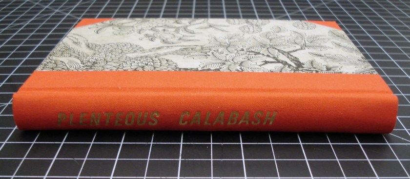
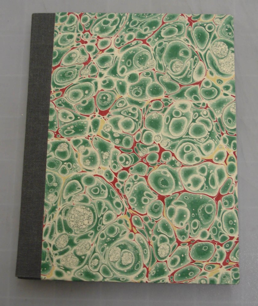
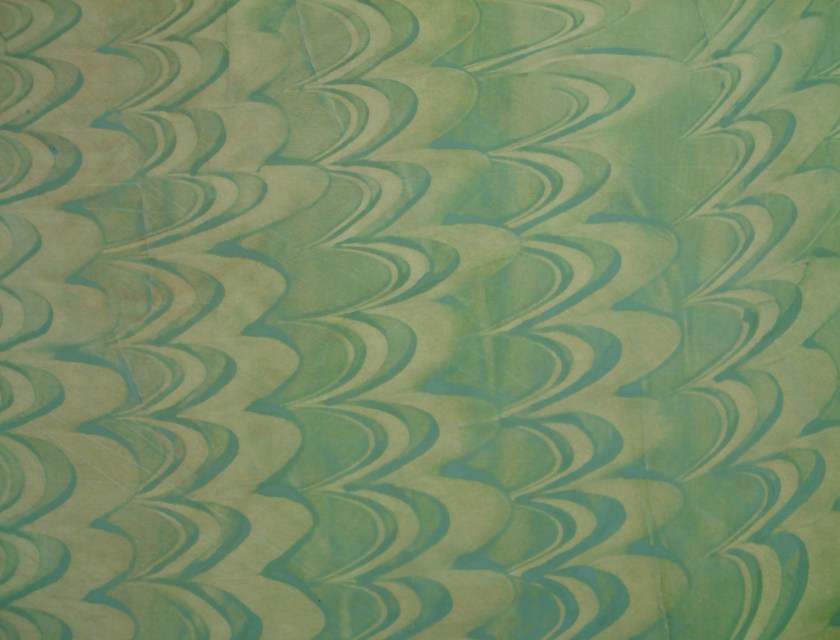
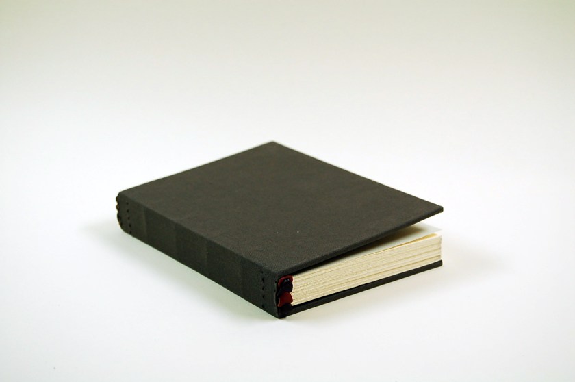
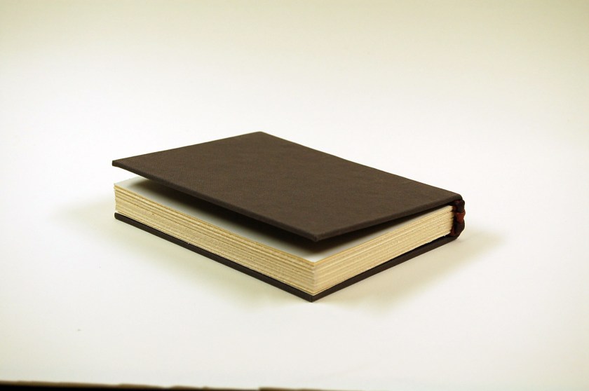
All of the books in this series were covered, in part or in whole, with the same paper-backed Asahi book cloth (available from Talas).  I really like this stuff because of its thickness, nice texture, and variation in color – plus I had quite a bit of it lying around. The books were covered in three different styles:  quarter, half, and full cloth. The quarter style has just a strip of cloth covering the spine and extending about a fifth of the way onto the boards. The remainder of the board is then covered (“sided up”) with paper. This one is sided up with Ann Muir marbled paper.

In addition to the cloth spine strip, the half style bindings have cloth-covered corners.  The book below is also sided up with Ann Muir paper.

I tried to create some variation along the series – for instance, the example below is sided up with Egyptian tow flax Cave paper.

Finally, several of the case bindings were covered in full cloth.

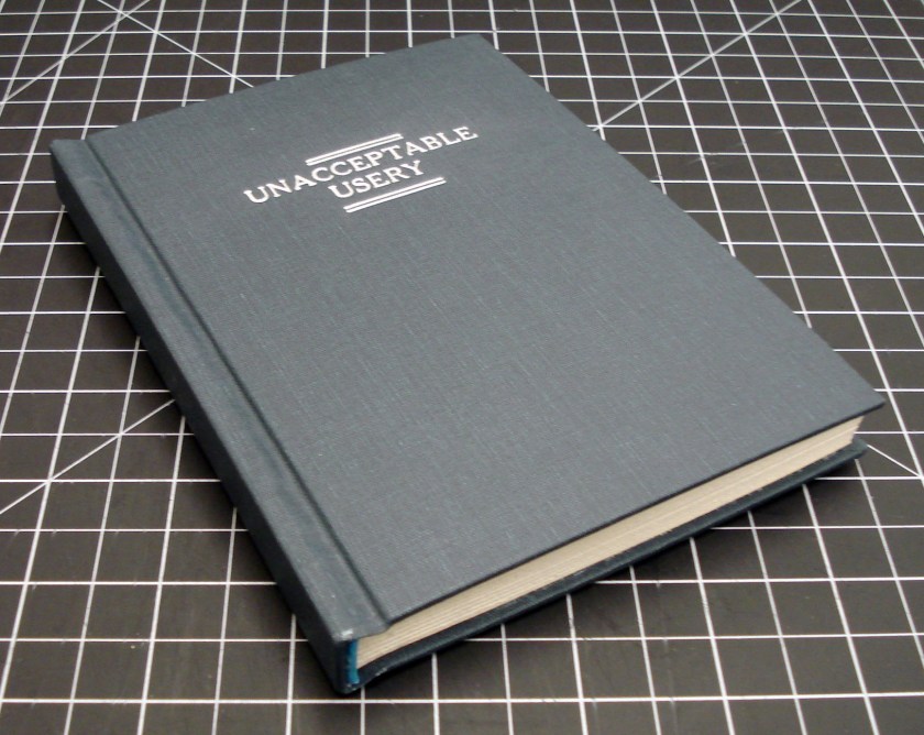
Each of the books in the series had to be labeled or stamped, and because typesetting in the Kwikprint takes quite a while, I went with two title layouts and varied the material with which the cover was stamped. The quarter and half style bindings above were stamped on the spine, while the full cloth cases immediately above and below were stamped on the front covers. The book above was stamped with gold foil, the book below was stamped with carbon.

I really enjoy the clean, matte impression that the carbon gives. I also think it is easier to do well. For stamping with foil one first has to make several blind impressions (that is with just the hot brass type), then one or two quick impressions with the foil in place. The gold is difficult to successfully work into book cloth and any movement of the case position on the stamping platen during this process will ruin the job – so great care must be taken. With carbon stamping, the hot type is first “loaded” up with carbon and the case is then stamped with a single, firm impression. As long as you don’t screw up that one stamp, you are good to go.

Another titling technique that I used on some of these books was a stamped paper label set in a label well. The well allows the label to sit just below the surface of the cover, protecting it from abrasion when the book is shelved. These labels are often done in leather, but I found that Cave paper also takes a rather nice impression. I’ll share more about leather labels in an upcoming post on in-boards bindings.

To create the label well, the boards were made by laminating a piece of 20pt board – with the label square cut out – to a piece of thin Davey board. It is important to keep the final board thickness in mind, as it must fit inside the shoulder of the bookblock to create a well working joint. It is also sometimes necessary to line the inside of the board before covering to counteract the “pull” of the 20 pt. When the book is covered, the covering material is worked into the label well with the bone folder. The label material is stamped, trimmed to size, and adhered inside the well. This titling can work on both full and quarter style bindings, however, one must shift the label position depending upon the covering style for it to look centered.

Endbands

Across the 12 case bindings, I tried several different styles of endband to go along with the endsheet and covering materials.

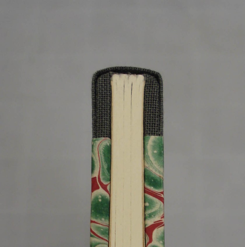
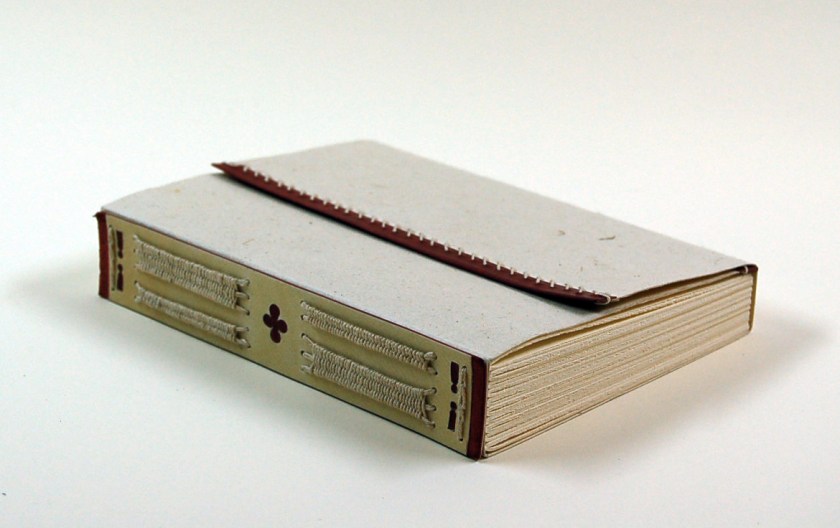
As these are case bindings, I thought it appropriate to do simple stuck-on endbands in different styles for a number of them. The first is bookcloth (the same used for covering) rolled around a hemp or linen core that is trimmed to size and stuck on the spine with PVA. This is about as unobtrusive as you can get.

I also experimented with stuck on endbands made from marbled paper wrapped over a rolled paper core.

I’m still not sure how I feel about these – they are more a little more lively than the rolled bookcloth, but also look a bit strange and are very stiff.

For the sewn endbands, I also tried to keep them as simple as possible. As I said in the last post, a complex endband on a case binding is a bit weird. All of these are two or thee color silk thread on a round leather core. You can find excellent instructions (with diagrams) for sewing these endbands in Jane Greenfield’s book (see bibliography below).


Back in December I shared the process for doing a graphite edge on a book. I only did this for two of my case bindings – mostly just to get a bit of practice.

In each case, I gave them a pretty dark headband.

One of those edges is also gauffered or “impressed with finishing tools in repeating patterns” (Etherington & Roberts, 1981). The photo below is not the greatest, but it will illustrate the point.

Endsheet Structures

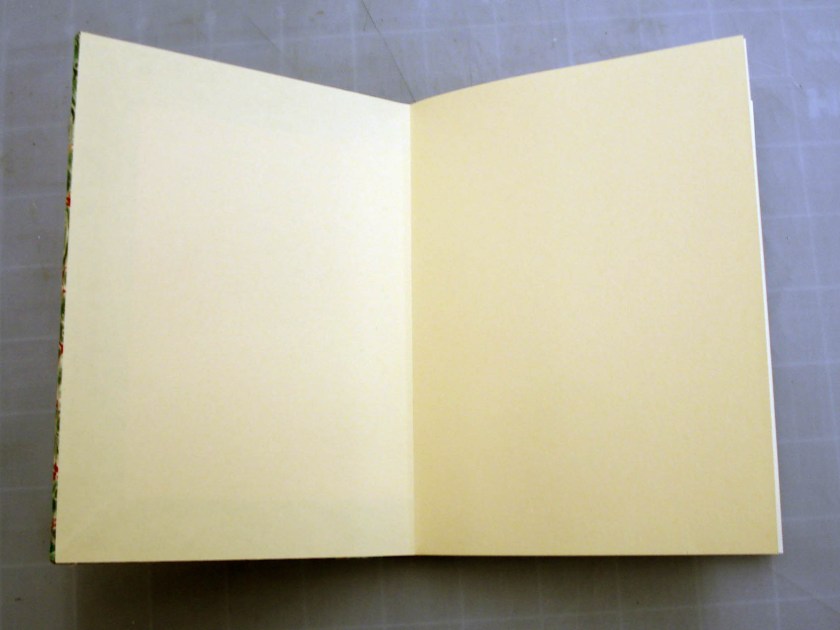
Several different endsheet materials and structures were used in this series of case bindings. Both Johnson (1978) and Middleton (1996) provide excellent diagrams of a variety of endpapers and discuss the relevant merits and shortcomings of each. Of the different papers used as endsheets in this series, the “vellum” shade of the Mohawk (pictured below) was the most plain.

Ingres, a mould made paper with a laid finish manufactured by Canson and Hahnemühle, offered a nicer alternative.

On the full cloth bindings, I tended to go for a marbled endpaper to spruce them up a bit.

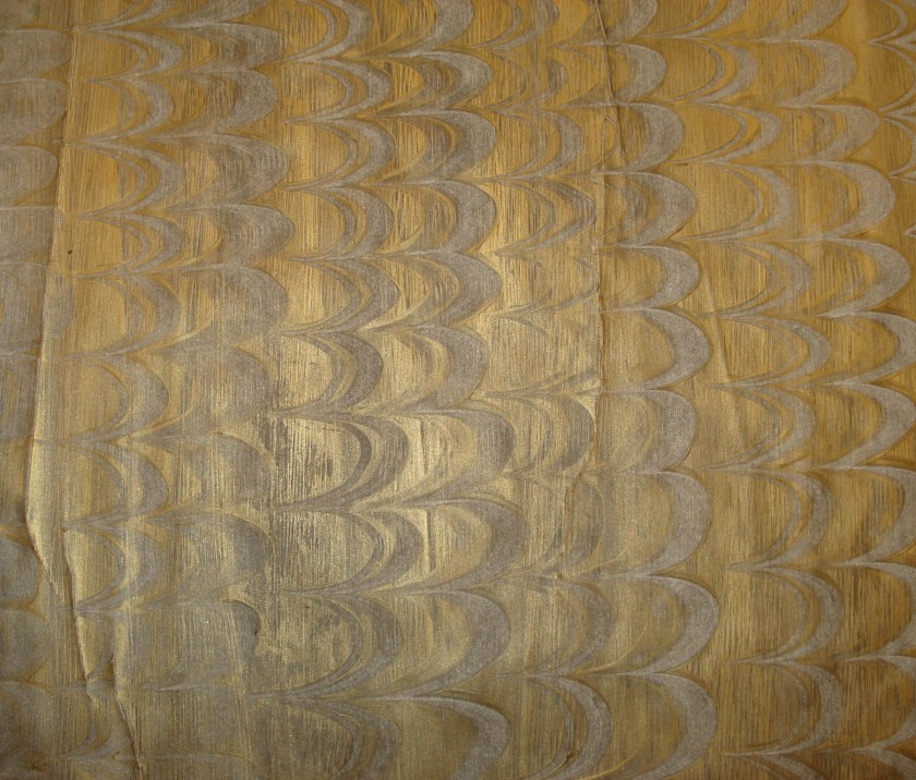
As marbled paper is often discolored on the back, I would use it in a made endpaper. In this form of endsheet, two fly leaves are laminated together to form a stiff leaf.  Here is an example with marbled and mohawk papers.

This one is made with marbled paper and Ingres.

A few of these case bindings incorporate an exposed cloth hinge (of the same cloth as the spine covering) that is incorporated into the endsheet structure. In this case the outer leaf of the endpaper is not pasted down, but a separate paper is put down to counteract the pull of the covering material but does not cover the hinge. I’ve seen this referred to as an “island paste-down” (Smith, 1998, p. 351) – I do not know if Keith Smith or Gary Frost coined the term.

Johnson (1978) includes two rather interesting variations on exposed-cloth jointed endpapers for account books that are “designed for extreme hard wear and durability” (p. 59). Even though these models are rather small and in no way require such a reinforced structure, I thought they were fun to do and looked nice.


Well, that is about all I have to share of interest in the case binding department. I just finished a few new projects and photographed them this weekend, so stay tuned. Up next will be either clamshell boxes or a structure we call onset boards… I haven’t yet decided


You may have noticed that I changed my blog theme to more prominently display my blogroll. Do you have a book related blog or photostream? Comment with your link!


_____________________


Etherington, D. & Roberts, M. (1982). Bookbinding and the conservation of books : A dictionary of descriptive terminology. Washington, D.C.: Library of Congress.

Greenfield, J. & Hille, J. (1986). Headbands : How to Work Them. New Haven, Conn.: Edgewood Publishers.

Johnson, A. W. (1978). Manual of Bookbinding. New York: Scribner.

Middleton, B. C. & Nixon, H. M. (1996). A History of English Craft Bookbinding Technique. New Catle, Del.: Oak Knoll Press.

Smith, K. A. & Jordan, F. A. (1998). Sewn and Pasted Cloth or Leather Bookbinding for Book Artists Requiring No Special Tools or Equipment. Rochester, NY: Keith Smith Books.

Advertisement

Case Bindings, Pt. I

Bookbinding

After spending a good deal of time exploring medieval book structures, the first years fast-forwarded a couple hundred years in bookbinding history to work on case bindings. Case binding is a general term referring to book structure in which the case (covered boards and spine) and book (textblock and endsheets) are prepared separately and later adhered together (Etherington & Roberts, 1981). Both Frost (1982) and Cloonan (1991) indicate that paper case bindings in form or another were popular in Italy and Germany as early as the 17th century; however, the cloth-covered variety that we are producing is very much a 19th century form (Frost). Case binding offers a distinct manufacturing advantage over in-boards structure in terms of mechanized processes, because the covers can be decorated (stamped) flat when they are off the book.

These book structures introduced a few new concepts and techniques to us, including rounding and backing, spine lining, sewn endbands, and hot-stamping. Practice is an important aspect of learning any hand skill, and, because case bindings are quickly produced, we churned out as many variations as possible over two or three weeks. In this first post, I’ll go over the three general types of case binding that we covered, as well as share a model of each that I produced.

All of our cases did have a few structural aspects in common, in order for us to speed up the sewing by batching textblocks on a sewing frame, as well as to actually feel how different endsheet structures and spine linings affected the way the book opened. These commonalities included using Mohawk Superfine for the text, trimming to the same model size (155mm x 115mm), and sewing all-along on Dutch-style linen tapes. Doing this allowed us to speed up the sewing by batching textblocks on a sewing frame. It also allowed us to actually feel how different endsheet structures and spine linings affected the way the book opened. Sheets of mohawk are rough-cut, folded into sections, pressed, and sewing stations pierced as I described in my post on Sewn Board Bindings. After rigging up a wooden sewing frame with tapes, we sewed six or so textblocks at a time – making sure to dress in traditional 18th century bindery-girl garb as we were doing it.

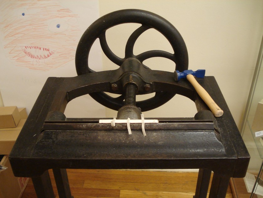
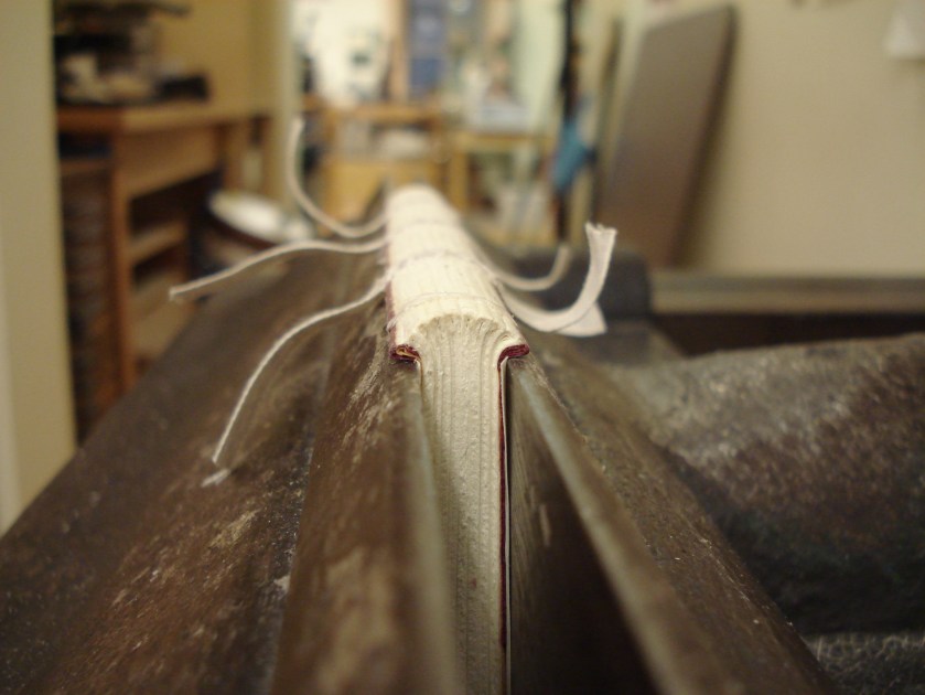
The textblocks are then squared up flat on a table with the spine overhanging the edge and a small weight to hold the book block in place. Hot animal hide glue (a rather pungent, water-soluble protein adhesive) is then applied to the spine. The adhesive is worked into the little “valleys” between sections and any excess glue is wiped off of the spine with a cloth. When the hide glue is dry enough to firm up, the textblock is gently rounded with a hammer. Rounding the spine of a book allows for the even distribution of the swell from the sewing thread and keeps it from eventually going into a concave round (Young, 1995). The rounded textblock is then placed in the job backer for backing, being careful to align it properly and evenly. The picture below shows off the department’s rather handsome cast-iron job backer, and features a portrait gracefully donated to the bindery by Jeff’s son.

Young (1995) rather concisely describes the purpose of backing as to “set the rounding and to distribute the remainder of the swell, and at the same providing shoulders to accommodate the thickness of the boards to be used in making the cover” (p. 102).

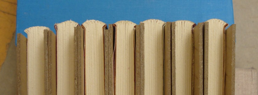
The backing job required depends upon the type of binding desired. There is plenty of excellent literature out there that describes how to successfully back a book for its intended function – so I will leave the subject well alone here. Besides, I’m not one to talk about quality rounding and backing; for every 10 backing jobs I do, only one or two look halfway decent. Just look at the set of seven below.

When the book is backed and dry, the endbands are put on and the spine is lined with various combinations of textile and paper. Spine lining is also a rather complex subject that I will not try to tackle in this post – but if you’d like to read more about it, I really enjoyed Tom Conroy’s 1987 paper on the movement of the book spine from the Book and Paper Group Annual (found here).

We focused on three styles of case binding: the built-in groove, the flat-back, and the pressed-in groove.

Built-in Groove

The built-in groove case is composed of two boards and a thin spine stiffening strip that are joined by strong paper before the case is covered. Peter Verheyen (2002) also calls this structure a Bradel binding and indicates that this method of case construction is particularly suited for amateur binders because it easily allows for a precise fit to the textblock. You can read the revised version of his paper describing the structure (including some very nice illustrations) here. For the first few models that I made, I tried to make use of scrap book cloth and siding up material – that way, in the event of an irreparable mistake, I could just toss it without feeling like I was wasting materials. This resulted in a rather strange combination of materials – one of those being the amusingly gaudy number pictured below.

This one has 2-color sewn silk endbands (bead on the front) on a kind of tall, square leather core. I admit, these are a bit too much on a lot of levels. Sewn endbands on a case binding are kind of like putting spinning rims on a $500 minivan: they might look nice, but why go to all the trouble.

For this book, I also made my first attempts at foil hot stamping with the Kwikprint. I made sure to choose an italic sans-serif typeface to build upon the terrible “wow-factor” of the endbands. Getting a clear impression that is actually straight down the spine turned out to have a pretty high learning curve. And as you can see, I didn’t quite pull it off on this one.

But as monstrous as this book turned out to be, someone must have liked it, because it ended up selling at one of our fundraisers. Hopefully it will age well.

Flat-Back

The second style of case that we made was the flat back. For this structure, the spine is glued and lined without rounding so that it remains flat and the case is constructed with a piece of board as the spine piece. Unlike the pressed-in groove binding, the boards and spine piece are assembled as the case is covered. The groove is then pressed in with brass-edged boards. The example below has stuck-on endbands of rolled bookcloth and silver stamping on the front cover.

I should say that I find it pretty difficult to come up with anything witty or interesting to stamp on these blank models. The only way I am going to learn is to stamp as much as possible, however. So instead of wasting my time trying to be creative, I realized that I can rely on the ancient art of bibliomancy to “divine” my titling. The process goes like this: grab the largest dictionary, encyclopedia, or sacred text you have at your disposal. We have an absolutely massive unabridged Webster’s in the bindery that worked out rather well for this. Lay the volume, unopened, on a table. After performing an invocation/sacrifice or pouring a libation to the deity of your choice, close your eyes and, as the “spirit” moves you, open the book and place your index finger on a page. I would either pick the closest adjective/noun combination to the spot on the page or perform the operation twice to get a suitable adjective and noun.  I had a pretty expansive list of titles after about 10 minutes of using this method.

Pressed-in Groove

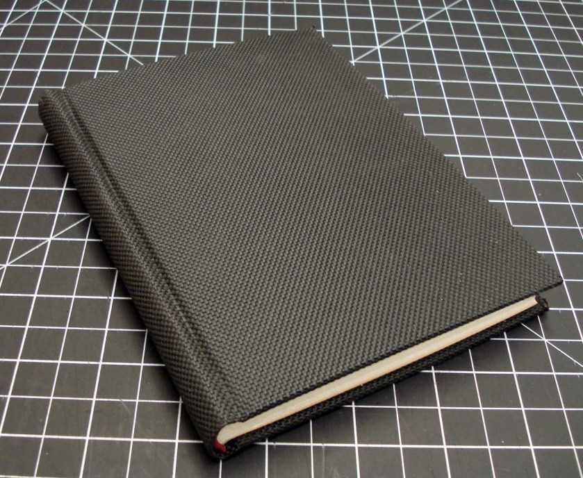
The last version of the case binding that we made was the pressed-in groove. This structure combines a couple different aspects of the methods of assembly for the other two. In this case binding, the textblock is rounded and backed and the case makes use of a thin, flexible spine stiffening strip like the Bradel; however, the case is constructed as it is covered like the flat back. Brass edged boards are used in the press after casing the textblock in to give it that nice French groove. The most exciting model that I made was the one I like to call “The Bulletproof Book”.

This one is covered in a paper-backed ballistic nylon bookcloth called Techno. Unfortunately, Techno has been discontinued by the manufacturer, but you can still get small quantities through Talas. This stuff is pretty crazy – it’s tough to cut and impossible to stamp. Techno does fray out very easily, so after covering the corners at the fore-edge, I had to burn the exposed edges of the cloth with a lighter to seal them up. This cloth has a very pronounced texture that, after casing in, gets pressed straight through the pastedown. But it is shiny and feels rather nice in the hands.

I’m pretty sure this would stop a small handgun – but of course I’ll have to wait for the field test results before I start marketing books as body armor.

That’s all for my general overview. Next time I’ll share photos of a series of more “polished” case bindings.

_____

Cloonan, M. V. (1991). Early bindings in paper : A brief history of European hand-made paper-covered books with a multilingual glossary. Boston, MA: G.K. Hall.

Frost, G. (1982). Historical paper case binding and conservation rebinding. The New Bookbinder, 2, 64-67.

Roberts, M. & Etherington, D. (1982). Bookbinding and the conservation of books : A dictionary of descriptive terminology. Washington, D.C.: Library of Congress.

Verheyen, P. D. (2006). German case (Bradel) binding. Skin Deep, 22, 2-7.

Young, L. S. (1995). Bookbinding & conservation by hand : A working guide. New Castle, Del.: Oak Knoll Press.

Return of the ‘Kettenstichheftung’

Bookbinding

As Boston is currently being pummeled by snow, I figured it best to stay inside and catch up a bit on my bloggin’. Ever since we first tried out some variations on limp medieval structures back in October, I’ve been meaning to revisit them using materials that are a little more refined than paper covers and laminated skin spine plates. I went back through the chapter on limp structures in Szirmai’s (2000) Archaeology of Medieval Bookbinding as well as Pam Spitzmueller’s article on long and link stitch structures (GBW Journal, 2000)  for some inspiration from historical examples. It seems in any of the literature on this type of structure, one inevitably finds images of two particularly fine examples from the Herzog August Bibliothek in Wolfenbüttel (pictured left and center below).

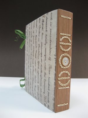
Loubier (1926, p. 9)  describes these structures as “Kettenstichheftung”, and Szirmai (2000) indicates that they amount to about 40% the total number of medieval volumes with rigid back plates dating from 1375 to 1500 surveyed in the literature (p. 299). These volumes are nearly all literary manuscripts on paper, covered in course parchment that is cut flush with the textblock. Some uncommon attributes include covers lined with paper, limp leather coverings, or leather edging.  Analysis of these structures has determined that the “equal number of chain links at each sewing station could be obtained by alternately omitting linking at the intermediate stations” (Adam, 1910). This sewing pattern is exactly as Larsson demonstrated in his 2004 presentation at Standards.  Szirmai states that “some chains are not functional but are solely decorative: the circular and two of the perpendicular chains on HAB Cod.Guelf.892 Helmst. (see Figure 10.12 [centre]), are chain stitches ’embroidered’ onto the back plate before sewing” (p. 299).

There is something quite satisfying about the sewing pattern in the center binding above (no. 892) and it has inspired a number of contemporary variations – including this one by Dominic Riley.

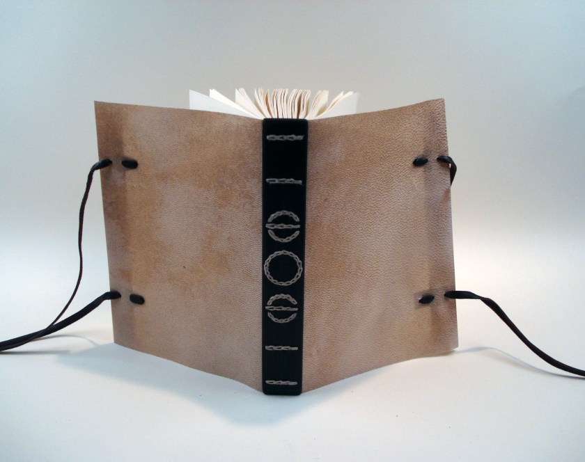
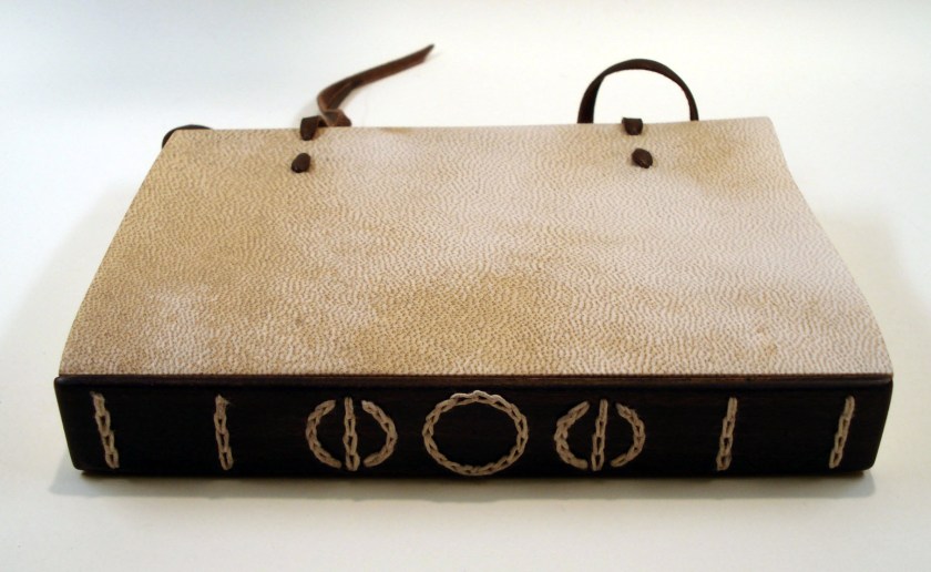
The fact that the circular sewing is not part of the structure makes the whole operation quite a bit easier; however there is still some planning that must go into mapping out the stations. While the original is done with a horn spine plate, I made a variation on this structure with a maple spine plate and goatskin parchment covers. As the width of my piece of maple was somewhat narrower than the horn used in the original, I decided to use the dimensions of my original spine piece as the basis for my final model size, rather than attempt to make an exact duplicate. There are quite a few holes to drill for this sewing pattern, and to ensure that I got it right, I first worked the pattern out to scale on paper.

As you can see, I’ve shifted the alignment of the 2nd and 5th sewing stations in order to make a more even spacing in the pattern for my model – with the kind of long and skinny dimensions of this book, it just looked better to me.   Next I went ahead and made a model of the spine plate with binder board covered in paper to check that the pattern looked alright with the rather thick size of thread (18/5) that I intended to use.

Taking the time to make this ‘dummy spine’ actually worked to my advantage, because once I had checked the layout, I just used it as a jig to punch the parchment cover and mark the wooden spine plate for drilling. When the spine plate and cover were ready, I stitched them together along the circular parts of the pattern. Paper sections were then folded, trimmed to the height of the spine piece, pierced with 6 stations, and attached to the cover via the straight chain sewing of the pattern using Larsson’s method. The final product looks like this:

The small sheet size and relative thickness of the paper, coupled with the rigid spine plate, make the opening of this book is kind of stiff but quite strong.

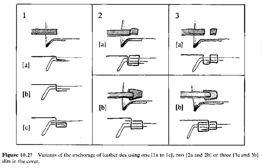
As for the fore-edge treatment: in the photographs of the original, it looks like there were, at one time, buttons attached to the spine plate. I can only assume that there is/was a fore edge flap with ties that once attached to the buttons to hold the volume closed, however I could not find a decent photo of what is actually going on there. Szirmai includes diagrams of a few variations on leather ties for limp structures, and I decided to go with a three-hole structure (listed as 3a in the diagram below) that offers a simple outward appearance.

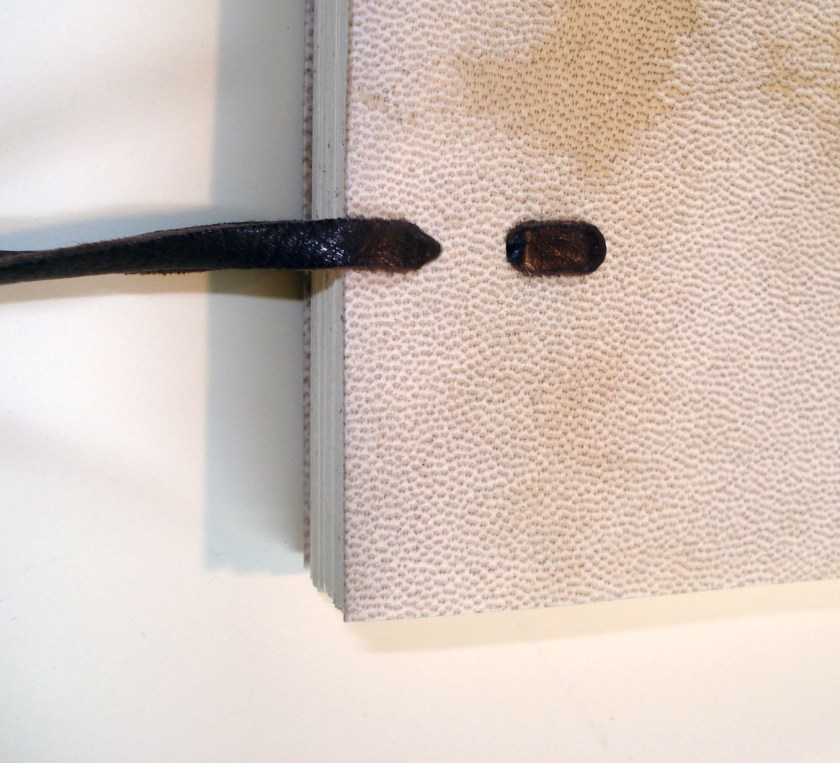
The diagrams appear to illustrate the leather tie lacing through slots in the covers, but I found that after mechanically softening the leather, the lacing looks a bit neater when done through rounded holes. This also keeps the parchment from splitting or tearing at the edges of the slot.

The structure of the tie also holds the simple turn-ins of the stiff parchment together.

References:

Adam, P. (1910). Die altesten heftweisen und ihr Kirfluss auf die jetzt ubliche Heftweise, Archiv fur Buchbinderei, 10, 73-6.

Loubier, H. (1926). Der bucheinband von seinen anfangen bis zum ende des 18. jahrhunderts zweite, umgearbeitete und vermehrte auflage. Leipzig: Klinkhardtand Biermann.

Spitzmueller, P. (2000). Long and link stitch bindings, Guild of Book Workers Journal, 35 (2A) 86-112.

Szirmai, J. A. (2000).  The archaeology of medieval bookbinding. Aldershot, Hants. ;: Ashgate.

Points of Interest

Bookbinding, Fieldtrips

First off, I’d just like to apologize for being such a negligent blogger. The last month has been rather packed with projects, and although a lot has been happening, I have been too preoccupied to share any of it. Therefore I’ll try to give you, the gentle reader, all the highlights in one post. I’ve been listening to way too much This American Life recently, so this installment is organized into three acts.


ACT 1: MARKING TIME

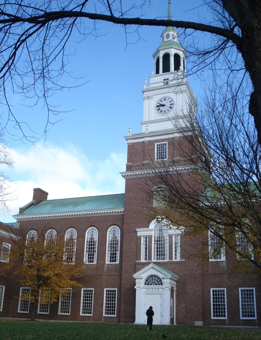
In early November, we took our first field trip up to Dartmouth College. Deborah Howe, the collections conservator, invited the bookbinding department up to Hanover to tour the library’s conservation lab and to assist in the unpacking and installation of the Guild of Book Workers Marking Time Exhibit.

Dartmouth’s campus is stunning and we arrived just in time  to see the changing leaves at the height of their transformation. As a southern boy, it is somewhat surreal to be encircled by such intense New England “Autumn-ness”; The old brick buildings and foliage are just so picturesque that they seem fake sometimes. Regardless, the Baker-Berry library building itself is as excellent inside as out; in addition to the well-placed exhibit spaces, the reserve corridor of the library houses Jose Clemente Orozco’s mind-blowing mural The Epic of American Civilization. We were also quite impressed with the size and adaptability of the lab space in Preservation Services.

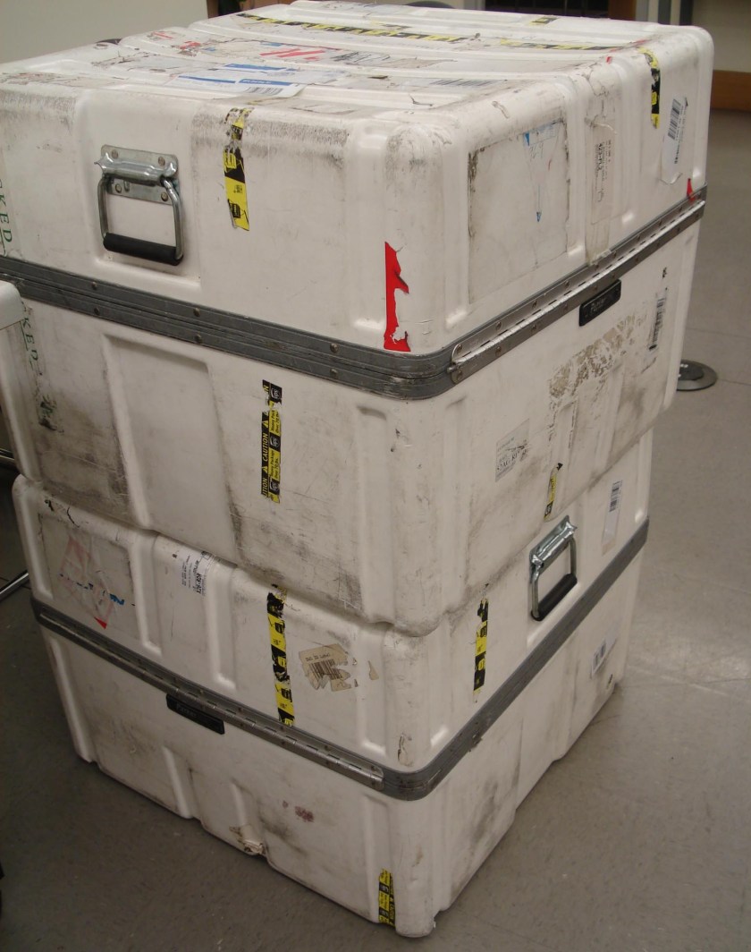
Shortly after our arrival that morning, the exhibit was delivered in three large crates.

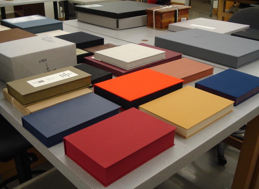
After unpacking the contents of the crates, we arranged them alphabetically by artist on several large tables in the lab. Each exhibit book comes in its own custom enclosure with a condition report and detailed instructions for its display. We broke up into teams and documented the condition of each exhibit item before transferring them to the secure exhibit cases. There are around 50 items, of various shapes and sizes, in this traveling exhibit. To give you an idea, here is about half (in their individual enclosures) spread out on two tables. For excellent photographs and descriptions of the books themselves, please visit the exhibit website.

I really enjoyed the opportunity to experience the behind-the-scenes aspects of a traveling book exhibit. There are so many logistical challenges involved in unpacking and repacking a large group of delicate and valuable items, and it was fascinating to see the solutions employed by the organizers of the show. For example, after determining the best way to pack 50 oddly sized boxes securely in three crates, how does one ensure that they are repacked the same way as the exhibit travels through the eight locations on the exhibit schedule? In this case, each crate included a detailed packing list as well as printed photographs of each layer of boxes and packing materials as they should be placed in the crate.  Taken with the packing instructions by each book artist, every step in the packing process is well documented.

In addition to working on the exhibit, our field trip included a brief tour of the Book Arts Program facilities and the opportunity to handle some high spots from the rare book collection. The special collections at Dartmouth are stored in an amazing climate-controlled glass cube!

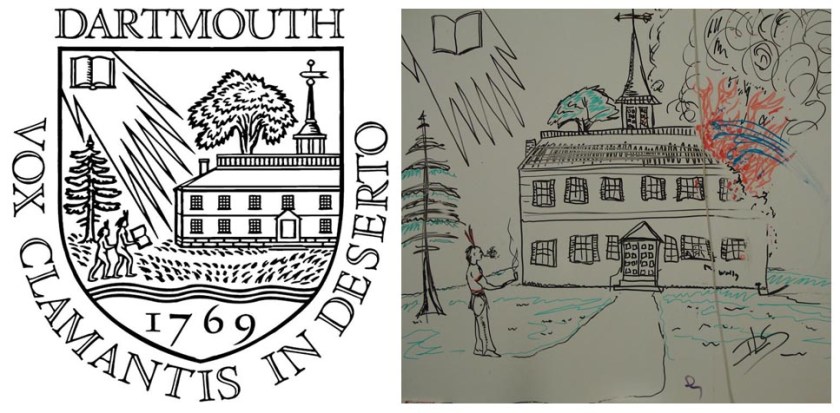
But aside from book things, as we wandered through the campus I managed to snap some photos of two particularly amusing examples of Dartmouth student humor. The first is an re-imagining of the Dartmouth shield by an anonymous artist on the white board of an empty classroom.

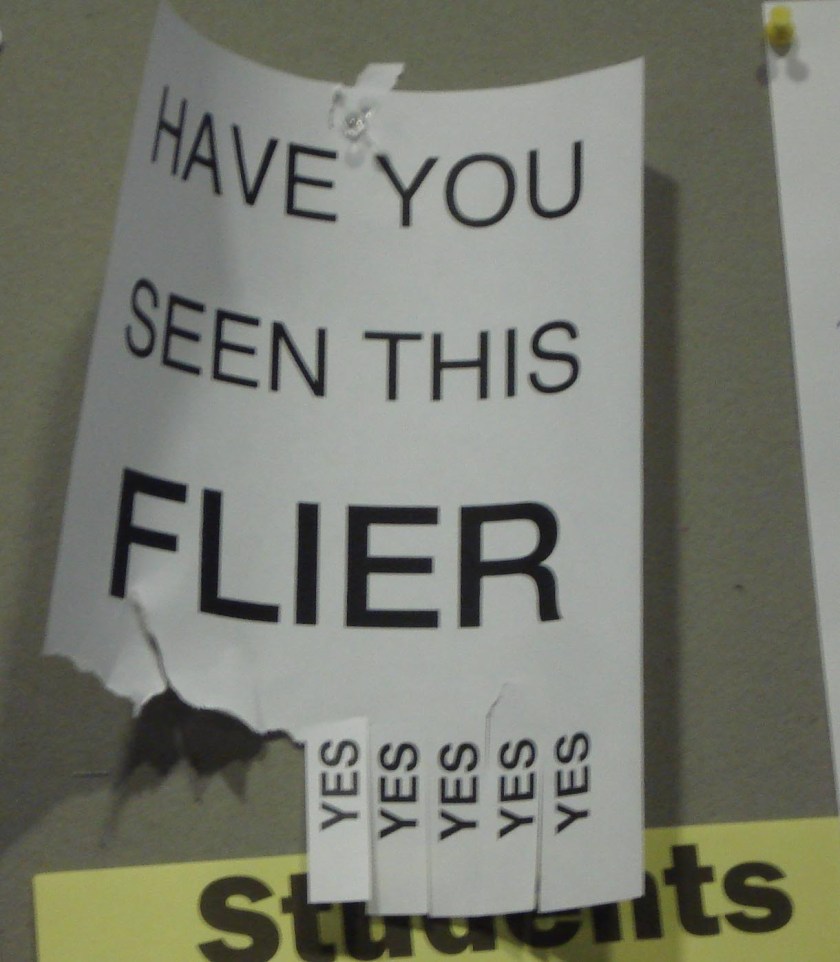
The other is a flyer posted on a bulletin board in the cafe area of the library.

All in all, our outing was an amusing and edifying experience. Special thanks to Deborah Howe and Jay Satterfield for taking the time to make our trip so enjoyable!


ACT 2: GRAPHITE EDGES

As I may have mentioned before, one of the current projects in the first year is an “edition” of 12 case bindings that exhibit common materials but very in case style, endpaper structures, headbands, stamping, and edge decoration. I should be finishing this set this week, and will post pictures soon. In the meantime, I wanted to share some edge decoration that I think is very cool.

With a bit of nagging, we got Jeff to demo the proper operation of the plow and edge treatment with graphite. The plow is a device used for trimming a very smooth edge on the textblock. Etherington and Roberts describe the plow as such:

“It consists of two parallel blocks of wood about 4 inches wide and 8 inches long connected by two guide rods and one threaded rod, with a cutting blade attached to the lower edge of one of the blocks. The left hand part of the plow fits into a runner on the left cheek of the lying press, while the other block is fitted with the adjustable knife. The knife is generally moved inward by the turn of a screw, cutting into the leaves as the plow is moved back and forth.” (under “Plow“)

At NBSS, we have a very nice plow and lying press made by Timothy Moore, much like this one:

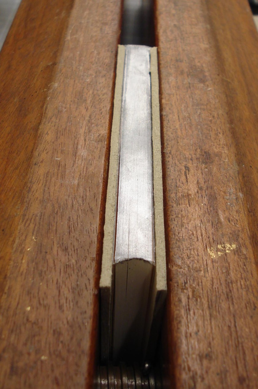
After plowing the edges of a couple of my textblocks, I decided to attempt to decorate the top edges of two with graphite. The process involves sanding the plowed edge to get it very flat and smooth. A mixture of graphite powder and paste is applied and rubbed in with one’s thumb. The edge is then scraped clean again with a metal scraper to really be sure that the edge is smooth and another coat of graphite and paste is rubbed in. After a light coating of bee’s wax, the edge is burnished with an agate burnisher. The result is a dark grey, polished edge.

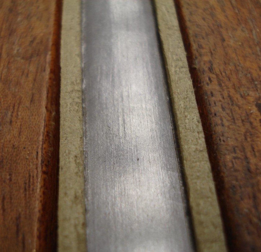
Graphite definitely gives the edges a very refined look, but it can be quite difficult to achieve an even finish. It is much easier (and cheaper) than gilding, but also functions to create a kind of seal between the leaves and reduce the paper’s exposure to dust and pollutants. Here is a close up image of the finished edge.

After the textblock is removed from the press, one must smack it sharply against the lying press or table surface a couple of times to separate the leaves.


and finally,

ACT 3: BOOKBINDERS MAKE MORE THAN BOOKS, APPARENTLY.

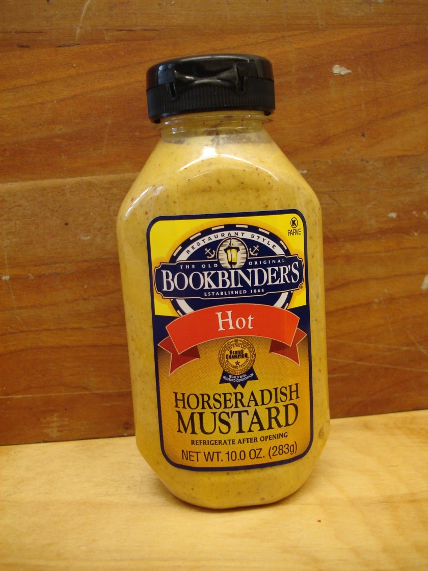
I had never heard of this restaurant/food product before Daniel brought it in the bindery the other day. I think it’s hilarious. You can read more about good ol’ Samuel Bookbinder (complete with jazz sax soundtrack) here or here.


That’s all for this installment. Next up, the return of the medieval linkstitch, the Big 12, and more!

Sewn Board Bindings

Bookbinding

In the coming spring, the bookbinding department plans to take a trip to England to visit notable libraries, conservation labs, binderies, and equipment suppliers. As this educational trip is outside the normal curriculum and we are responsible for our own travel costs, we have begun fundraising by doing what we do best: making books. This is also an excellent opportunity for us to get some experience in a more production style of working – rather than the single-item focus that our projects usually take.
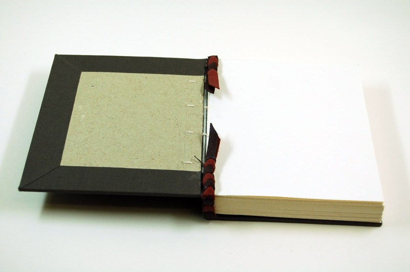
This year, we created a small “edition” of sewn board bindings to sell at the school’s annual open house and the Boston International Antiquarian Book Fair . This particular structure, designed by Gary Frost, takes advantage of the sewing and board attachment features of the earliest form of the codex but has a final form that is more in-line with a modern case binding. Like the Ethiopian and Coptic bindings that I shared some time ago, the sewn board binding exhibits unsupported sewing, a squareless cover ( i.e. cut flush to the text), and boards sewn directly to the sections. In the Ethiopian binding, the sewing passes through a lacing path drilled through the board, while in the sewn board structure, the covers are composed of folios of thin card that are “sewn to the text as if they were outermost sections of the book”  (Booklab Booknote 8, p. 2). Frost (2004) describes the “particular attribute of the through the fold sewing pattern across the entire bound book” as a “secure cover to text attachment”, providing “exemplary docile, flat opening”. This helpful feature provides a “full gutter reveal” so that books with text are more easily scanned or copied, while blank books are more easily inscribed. The textblock of the sewn board structure has little or no shoulder, requiring “no damaging or distorting backing of the outermost gatherings” (Frost, 2004). In addition, the squareless cover prevents the textblock from sagging when shelved upright.

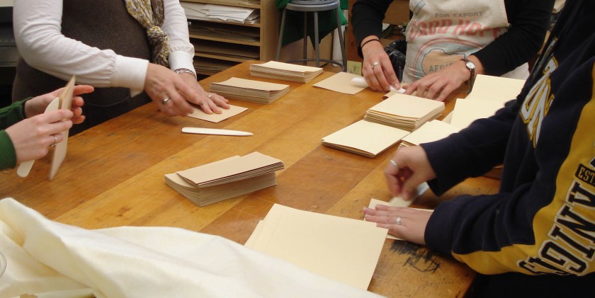
A description of the benefits of the sewn board structure is all well and good – but a description of the production may be more useful to the reader. We began the project by outlining the materials required and individual steps of the project. Each person would make 12 books, and each book required 4 sections of text paper, 2 folios of endsheet paper, and 2 folios of 20 pt board for the covers, as well as filler board, book cloth, and decorative paper covering. Jobs were distributed among the first years: a person was assigned to each board sheer, cutting specific dimensions of paper and board, while another group of students gathered around a large table, dividing up the stacks of paper and folding sections.

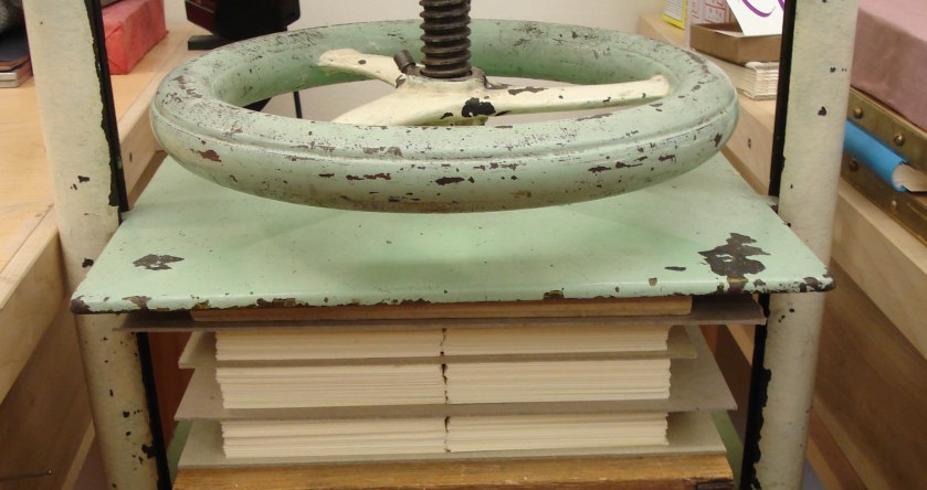
Next the folded sections were distributed into even piles, placed between boards, and pressed overnight.

The next day, endsheet folios were tipped on to the outer sections with PVA (polyvinyl acetate) and the sections and boards of each volume were pre-pierced for sewing using a guide. The sewing pattern of 6 sewing stations is the same used for link stitching across linen tapes. The two outermost stations are used for the conventional kettle stitch, while the other pairs of stations provide another link. When the thread exits the section at one station pair, it is linked through the sewing of the lower section, creating a support. The picture below (found at random through the interwebs because I failed to take a decent picture of my own) illustrates the pattern.

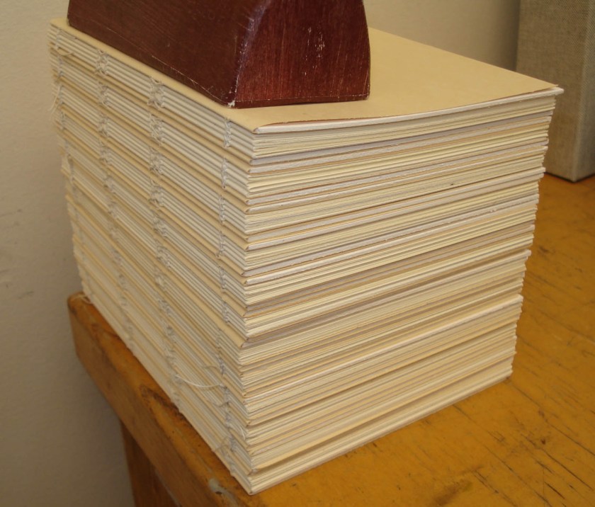
At this stage, the cover folio was also filled by tipping in a 4ply museum board at the fold with PVA. This will make a much thicker (and more pleasing looking) board later in the process. When sewn, my own stack of books looked like this:

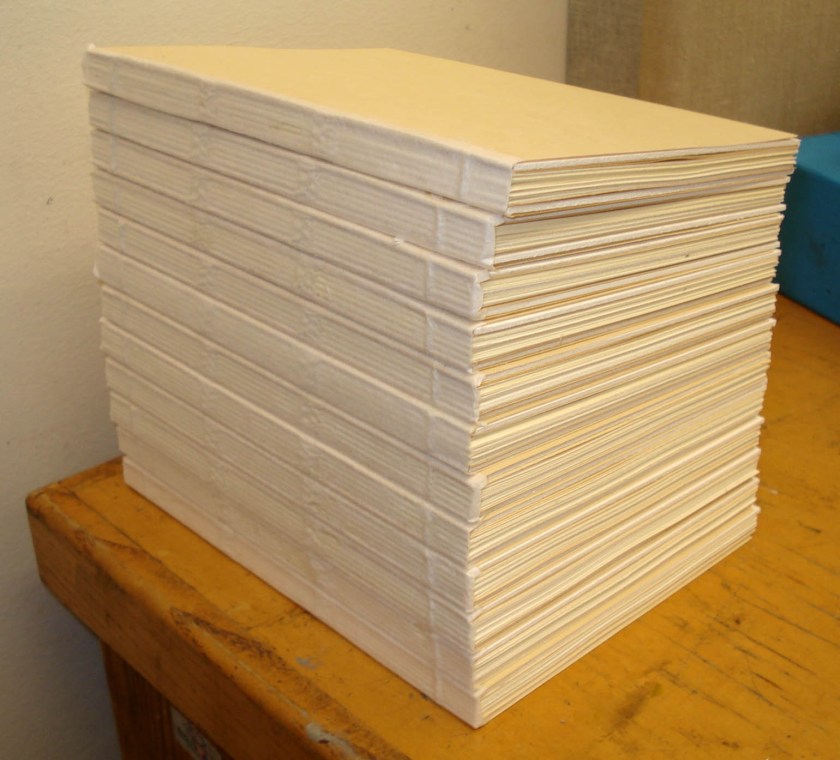
The next stage of the process involved lining the spines. Each book was pasted up with Aytex-P wheat starch paste and lined with a piece of Kizukishi Japanese tissue that extended on to each board about 1/8″. Etherington and Roberts (1982) indicate that the purpose of the spine lining is “to support it and to impart a certain degree of rigidity while still maintaining the necessary flexibility for proper opening” and that the “weight and stiffness of the spine lining material is of considerable importance.” In this case, we wanted to maintain the significant flexibility of the structure, so no subsequent paper or textile linings were applied. After lining, the spines look like this:


Up to this point, all of the book structures in the first year curriculum have been methodically trimmed, section by section, before sewing using the board shear. This process takes a considerable amount of time, so for our production project (and in accordance with Frost’s instructions found in the Iowa Book Works Kit) we trimmed the edges after sewing in a guillotine (or “hand lever cutter” – kind of like these). This gives the edges a very even, almost machined look. (When all stacked up, I kind of think they look like a layer cake.)

In the next step, little corners of book cloth were adhered with PVA to cover the areas of exposed board at the spine edges of the head and tail.

These add a little refinement to the finished product (as you will see shortly). In this stage, a filler card of 10 pt board was attached to the outside of the cover folios in order to even out the added thickness of the spine covering (that will be added in a later step).

The layers of the covers were then adhered together with 3M #414 Polyester Double sided tape. This allows the layers of board to be laminated together quickly, without the risk of warping from moisture in the adhesive or the requisite long pressing time.

With the boards now solid, book cloth spine strips were adhered with PVA. The spine covering is not adhered completely to the spine, but on the boards about a 1/4″ from the spine edge. This allows for a firm attachment of the material, but without restricting the opening of the book.

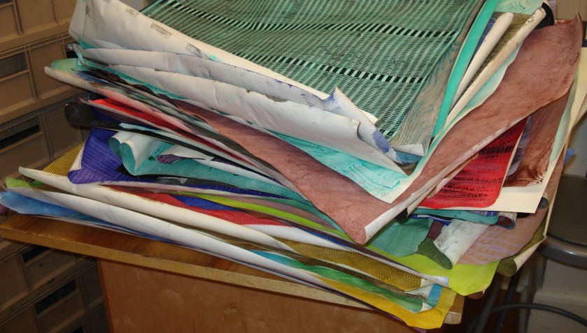
Finally, the books were covered with decorative paper. In many cases, we used paste papers that we had made in class a few weeks before.

Instead of gluing out the entire sheet of paper, the final board covering is “drummed” on. In other words, the edges of the sheet are brushed out with adhesive and the sheet is applied tightly across the board. Much like the method of board lamination, the drummed on paper allows the boards to be quickly covered while remaining flat. The endsheets are similarly treated; adhesive is applied to only the edges of the pastedown. The result is a thin book with thick boards and a flat spine. Here is an example I made with Italian marbled paper (by Atelier Flavio Aquilina) .

As you can see, the spine tabs and flush-cut boards give the book a very finished appearance while not sacrificing the flexibility of the opening.

Here is a view of the inside “paste-down” and flyleaf.

We had a lot of fun with this project. The sewn board structure is quite versatile and can be embellished with edge decoration and leather spines or simplified according to one’s taste. These books are also easily stamped – the spine can be stamped before being adhered to the board or the covers stamped after finishing. I also really enjoy the way that these books open. I think that I will use this structure for all of my future notebooks. As a conservation student, I will also be on the lookout for instances in which this particular structure might be used as a viable treatment option. I cannot sum up the advantages of the sewn board binding better than Gary Frost (2004) when he concludes, “This book conservation structure is based on historical prototypes, the historical techniques are adapted to contemporary production methods and the specific sewn board practice is directed to the best applications.”

Paste Papers

Bookbinding

As a first year at NBSS, we make many, many simple book structures in a given week. Plain paper coverings get old rather quickly, so as you can imagine we go through a huge amount of decorative paper. A couple of weeks ago the entire bookbinding department spent the day making paste papers. These papers are created with a paste and paint mixture and are common board covering and endsheet materials for books in the 16th-18th century. If you would care to get an idea of some traditional paste paper patterns, the University of Washington Library has a small collection of digital images available online (found here). Of course modern book artists and crafty individuals love paste papers because of their ease of production and versatility; I’d also wager that their popularity stems from the fact that they are kind of like finger painting in their execution. Case in point, Martha Stewart has even done a segment on paste papers with Sage Reynolds.

I approached this work day as an opportunity to experiment with materials, and, therefore, didn’t really study up on historical patterns and colors – so my papers are kind of all over the place. There is a lot of literature out there on decorative paper for books, so I plan on being a little more focused the next time I do this.  I’ll briefly describe how we went about making these papers and then share some of my results.

First off, we all rummaged through our respective basements, attics, and closets or went down to the local dollar store, drug store, etc. and grabbed any small object that we thought might make an interesting pattern. Combs, forks, potatoes, brushes, legos, toy trucks – you name it, we brought it in.

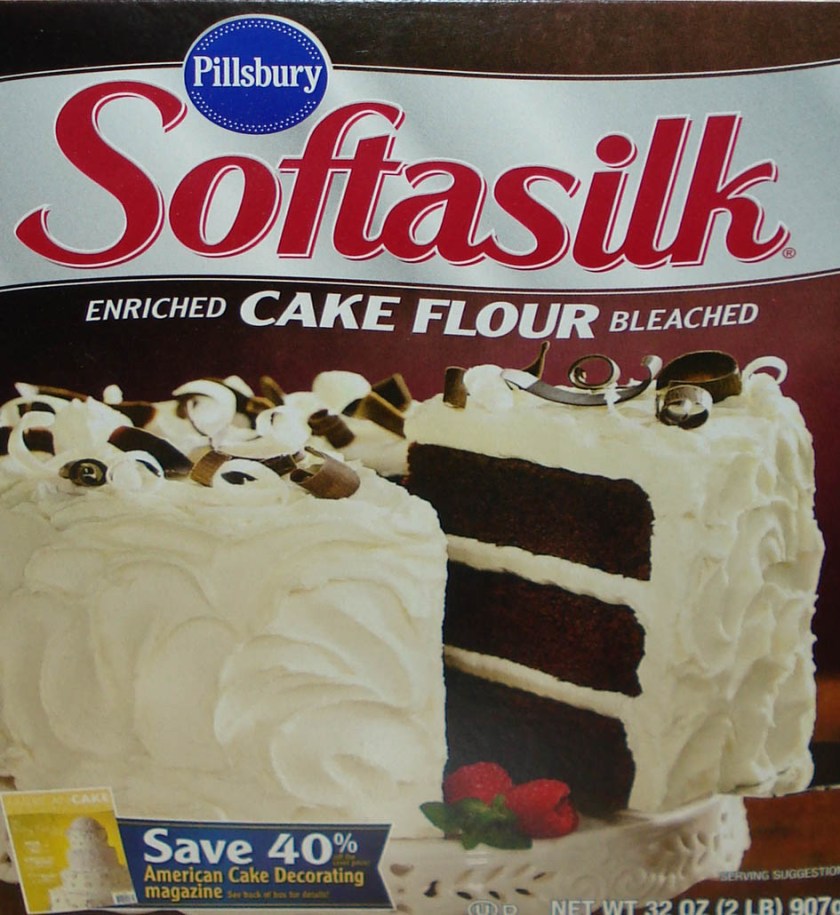
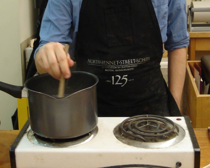
Then we made paste. There are literally hundreds of recipes out there for paste papers – Richard Miller put out a long list in 1995 on the Book Arts Listserv (found here)  – but basically the paste is made by cooking starch and water. You can use wheat starch, corn starch, or even cake flour.

Everyone seems to have a different opinion about which starches and starch to water ratios produce the best results. Some individuals advocate using methyl cellulose instead of paste. Having made few paste papers in my life, I have no real opinion one way or another. Rather than pick and choose, we went ahead and made 6 to 10 different mixtures to see how they compared.

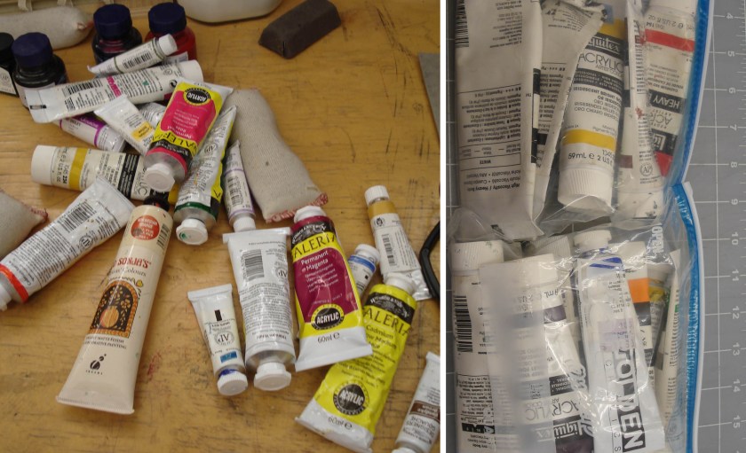
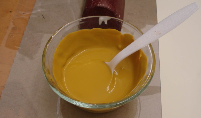
After straining the paste and letting it cool, we divided it up into small bowls and added acrylic paint.

The result is a nice, thickly colored paste.

This process can be messy, so everyone cut a large sheet of mylar to protect their bench.

We used 1/2 sheets of Mohawk Superfine for all our paste papers. This type of paper is economical,  good quality, and a 15″ x 20″ sheet will provide more than enough material for a few of our model-sized books. When the work space is ready, the sheet is wet out with a damp sponge. This allows the fibers of the paper to relax in preparation for receiving the paste. The moisture also keeps the sheet stuck to the mylar during the patterning.  The colored paste is then evenly brushed out onto the page and a tool is drawn across it to make patterns in the paste.  I started off with a small square that would give me evenly spaced lines.
After dragging it across the page in several directions, I got this pattern.
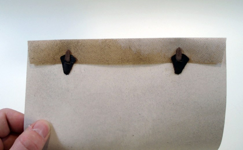
This is pretty rough-looking  because it was done free-hand. To make it look nicer, I really should have constructed a tool as wide as the entire sheet and set up the space with a guide on one side so that my lines are really straight and even all the way across. When the patterning is accomplished, the wet sheet is put in a drying rack for a bit.
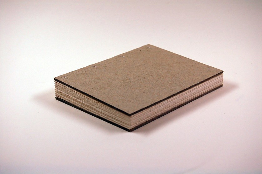
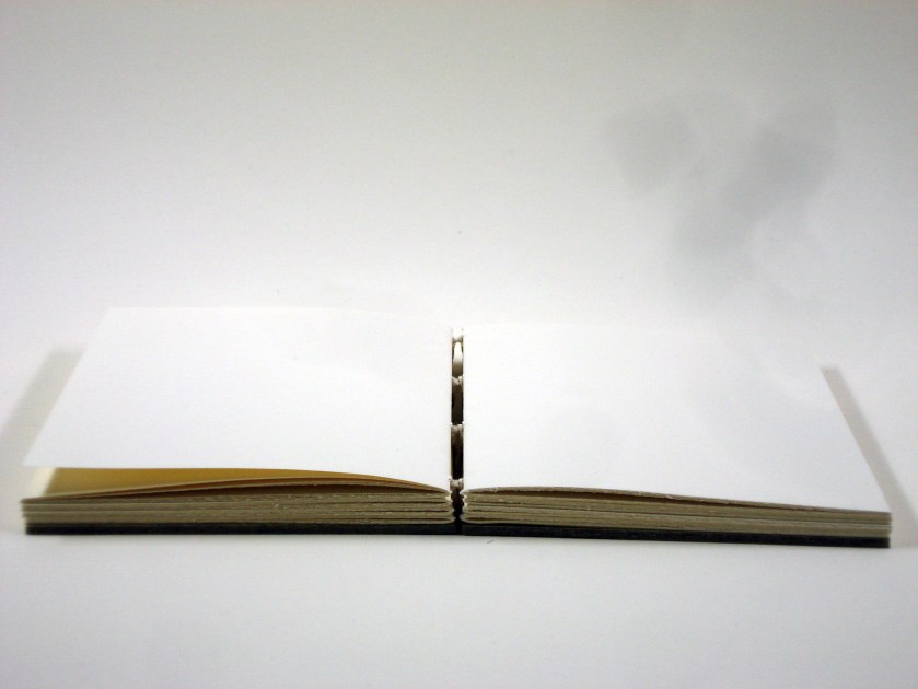
With so many people working at once, we quickly ran out of racks – so after each sheet had some time to firm up, we moved them to a clothesline to finish drying.

Below are some examples of the papers that I made. The first was made with that same plastic square.

This one was done with an “afro pick“.

I made a few calm ones with sponges.

I also made a few that had a little too much going on…

During the course of this, I tried to make a few papers that can be used for an upcoming project – the German paper binding or “pappband”. To get the appropriate pattern, one either sticks the freshly pasted paper together and pulls it apart or uses a sponge. In keeping with the historical examples that I’ve seen (like the one below), I tried to go with dreary, sort of ugly colors.

Below are some of those that I produced.

I confess that I’m not very good at the whole choosing sympathetic colors and patterns thing. I’m pretty jealous of a lot of paste papers that my classmates came up with. But the advantage of paste papers is that they are cheap and easy to produce – so I have plenty of opportunities to practice. In the meantime, I’ll be looking for specific examples in library collections to copy.

Next time, I’ll be sharing a recent production project that made use of these paste papers!

Long and Link Stitch

Bookbinding

I realized after my last post that when I took these pictures I did not include anything for scale. Therefore you (the gentle reader) have no idea what size these books really are. All of the models pictured are in fact quite small; the finished page size is about 15.5 cm tall x 11.5cm wide.

We continued our exploration of non-adhesive structures with a variety of long and link stitch bindings. The first was a simple link stitch with covers of single folios of decorated paper sewn through the fold. The folios were then sealed shut with double-sided tape to make a stiffer cover. Unlike the Ethiopian and Coptic bindings, these bindings are all sewn with a single needle.

The long stitch structures are all sewn through slots or holes in the covering material. As this style of binding can become very complex, I began with the most straightforward of pattern in a slotted wrapper of 20pt board.

The covers in my first model are cut to include a fore-edge flap for added protection to the pages. While the sewing can be a bit tricky to start, I was surprised at how stiff the cover attachment became in the end. It opens quite well.

I had a bit of the University of Iowa Case Paper lying around, so a made a better looking version of the same sewing pattern – only this time with a yapp at the fore edge.

After making a few entirely limp structures, we watched a video of  Adam Larsson’s 2004 Guild of Book Workers presentation about a collection of Medieval limp vellum and leather structures found at the Uppsala University Library. The collection originates from a monastery library and contains around 1000 volumes. Many of the items in this collection have stiff spine plates made of wood, horn, or leather and can be highly decorated with inlays or weaving over the exposed sewing.  The covers are usually leather lined with linen cloth (sometimes cut flush with the pages at the head and tail, sometimes turned-in) with a fore-edge flap that ties to buttons on the front cover or spine plate. Larsson reports that while the text of these volumes is typically on paper, the innermost folios of each section are either made of or guarded with vellum. It would appear that the original binders did not believe that the strength of paper alone was enough to hold the sewing together.

After showing a series of images from the Uppsala collection, Larsson demonstrates one of these structures with link sewing and buttons across the spine plate. While the pattern looks very simple on the outside, it is actually very difficult to follow. Larsson is quite fast in his demonstration and the instructions become a  blur of “in section 1, station 2. out station 2, row 1. in station 2, row 2 into section 2, station 2…” Luckily, someone from a previous class was kind enough to make a transcript of the instructions, and after much cursing and resewing, everyone ended up with their own model. My version has case paper covers and a spine plate made from two strips of vellum adhered to a leather core. The ties are woven linen thread that is stitched through the fore-edge flap.

This one also opens quite nicely – although the buttons on the spine do make it wobble around on the table surface.

For my second attempt, I worked on a long stitch structure with elements based upon the common features in the Uppsala collection. This one also has case paper covers and a layered spine plate of vellum and leather. The designs are made by shaping and punching the outermost layer of vellum to reveal the leather underneath. The exposed sewing is woven on the outside of the spine plate and the edges of the covers protected with sewn-on strips of leather.

I had a lot of fun with these limp structures and I will continue to experiment. There are so many different variations of sewing patterns and materials that, as Larsson says in the video, “the only limit is your imagination.” I am currently working on another model with a stained maple spine plate that I hope to share soon. I also found a thin brass plate the other day that I’d like to try out. But more on that later…

Next up, I’ve got pictures from our recent sharpening workshop.

Ethiopian/Coptic Bindings

Bookbinding

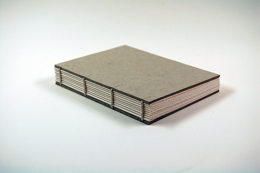
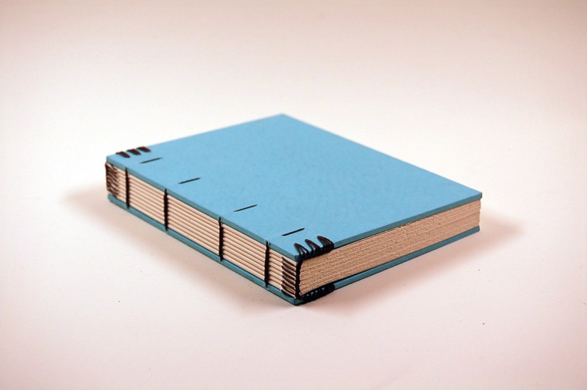
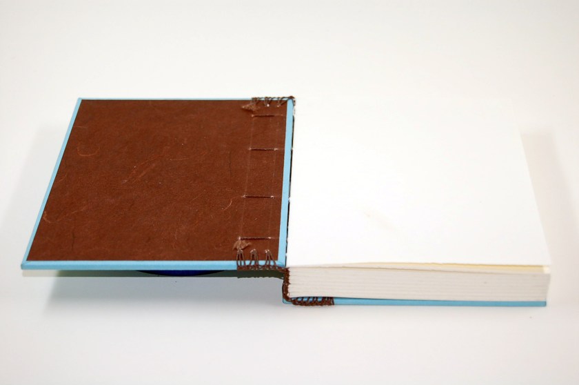
In the first few weeks of school, we started with non-adhesive structures. As one  of the oldest known forms of the codex, it is fitting that we started with Coptic style bindings. These bindings have chain stitch sewing that laces through the board. The sewing is done through pairs of sewing stations with a needle on each end of the thread. All of these models (unless otherwise indicated) are made with Mohawk Superfine paper and Davey Board covers. The holes in the board were created with a pin vise. The first model was made with no decoration or embellishment to get a sense of the structure.

(Click pictures to enlarge.)

In this style of binding, the boards are cut flush with the textblock. (Please forgive the crazy colors in these photos… I’m still trying to figure out how to set the white balance on the camera.)

One of the benefits of this binding structure is that it opens completely flat.

As with learning any new skill, practice and repetition are important – so I proceeded to  make a few more of these. First with some decorative paper covering the boards…

… then with a Coptic-style endbands. With this one, I moved the outermost sewing stations in a bit and pre-punched the sections for the endbands. I followed Greenfield and Hille’s instructions and after only about 5 attempts, succeeded in creating something akin to a Coptic headband. However, just a day or two ago while rummaging around the shelves in the workshop, I found a model supposedly done by Adam Larsson (the conservator, not the hockey player) that has an absolutely amazing set of Coptic endbands with links that are way tighter than mine. So I’ll have to work on those.

Next I tried some variation in the color of thread to create a nice pattern.

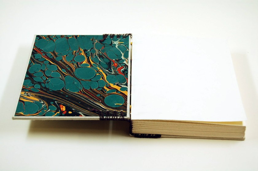
As well as some crazy marbled paper inside.

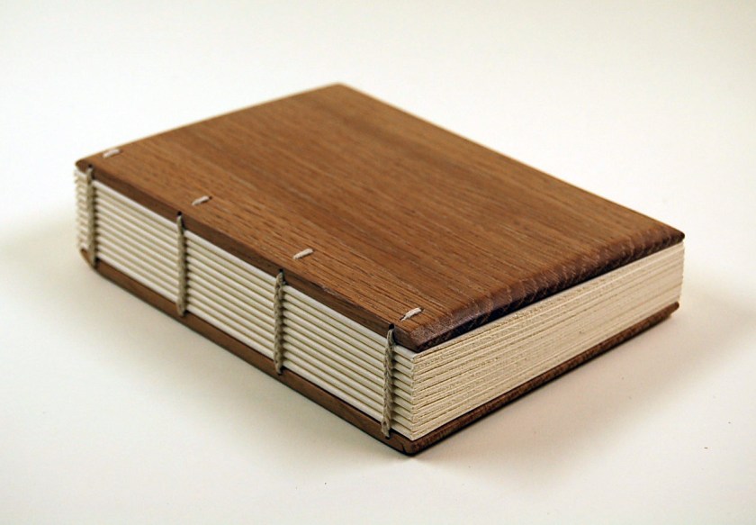
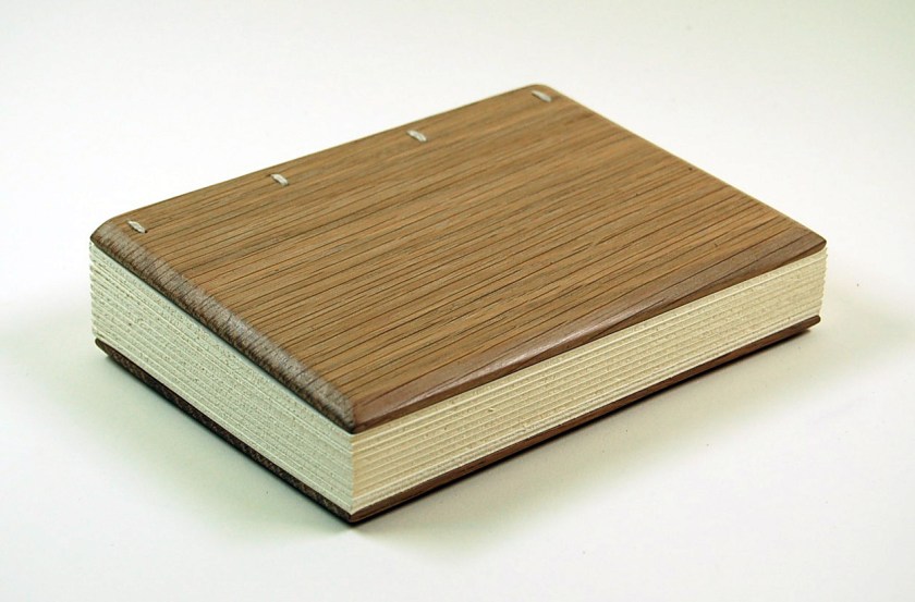
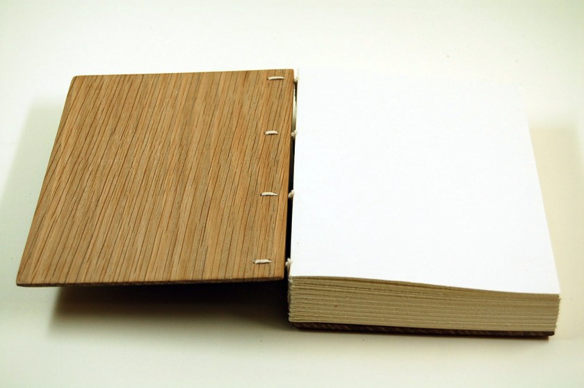
I also created a model with quarter sawn oak boards. The holes in these boards were created with a hand drill (like this one) and the bevel was made with a rasp. They were finished with a light coating of Renaissance Wax and polished.

Finally, I attempted a cloth-covered model with the Ethiopian style of leather headbands. The endbands themselves are made with two strips of leather laced together, and while they look nice enough, they put so much extra material in the joint that the boards splay out. 

I guess historically these books would be made with wooden boards and completely covered in leather, so the effect wouldn’t be quite so pronounced. But as for this model, I was not so enthusiastic about the result.

In the next few posts I’ll share some other types of non-adhesive bindings, as well as some pictures from our recent knife making/sharpening workshop with Jeff Peachey. Stay tuned!