Paper Marbling Workshop

Workshops

Recently, we spent a fun-filled couple of days with the Chena River Marblers, Regina and Dan St. John. With over 25 years of experience marbling, Regina and Dan have been coming to NBSS for some time now to teach the first years the basics of marbling and to instruct the second years in more advanced techniques. They also often teach one and two day workshops at their studio in western Massachusetts (see their website for details).

Marbled paper has a long and rich history, with various materials and techniques employed across Asia and Europe. At present, I know very little about that history, but have been finding Richard Wolfe’s book on the subject to be a handy reference (1). Regina and Dan instructed us in a modern method of marbling that makes use of surprisingly simple materials. Described briefly, acrylic paint is dropped onto the surface of an aqueous solution of Carrageenan (a polysaccharide extracted from seaweed) and manipulated to create a pattern. Next, paper coated with alum (the mordant) is laid onto the surface to transfer the pattern. Marbling is such a fun and fascinating process; I took quite a few pictures of the demonstrations and the many  papers that I produced.

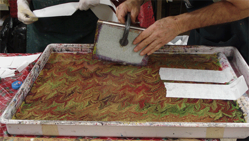
The following photos will outline the process for a kind of swirled pattern. First the surface of the bath is cleaned with a strip of newsprint.

Then colors are dripped onto the surface…

… and swirled with a stylus.

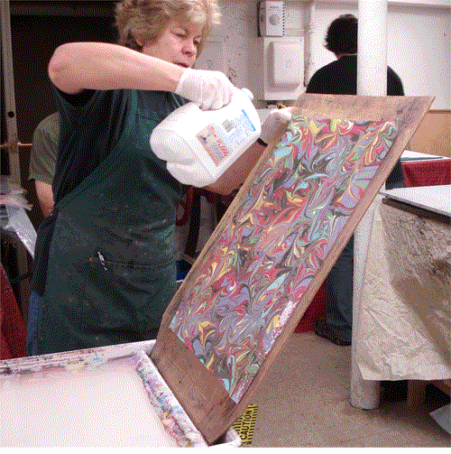
The paper is then applied to the surface with a smooth motion. I managed to take a load of sequential photos of Regina placing the paper and thought it would be fun to make a simple animation using state-of-the-art technology from 1995. Click here to watch!

The paper is pulled from the bath, set on an angled board, and rinsed with water. The water drains into the waste tray and into a bucket placed below. I also made a simple animation of that action (why, I don’t know…) that you can view here.

So many patterns and styles of marbled paper have evolved over the centuries, but Regina only had time to show us the most basic of them. By far, the easiest to produce is the stone pattern – in which the paint is either dropped directly from the narrow spout of the bottle or tapped from a brush to create many overlapping circles of color. Here are some examples that I produced. First a larger pattern…

… and then some smaller ones.

I cannot wait to use these to make some 19th century German-style paper bindings.

Apart starting from the random stone pattern, one can also create a bullseye pattern.

Below is a rather psychedelic bullseye pattern that I produced. I enjoyed using acrylic paint mixed with Photo-Flo to disperse the color, creating large holes in the color and allow the paper to show through.

These stone or bull’s-eyes can be manipulated with a stylus to produce a nice swirl pattern. Below are three examples that I made.

As a novice, I find it very difficult to fully anticipate how the color of the paper will affect the color of the paint. Often I’m going for a subtle melding of color and end up producing some garish monstrosity. The two examples below were made using the same color paint but on different papers (white and blue). I find the difference in results fascinating.

One can also use combs to produce a huge variety of patterns. Below is an example of a Rake comb that Dan made. The shape allows the comb to be used across both the long and short dimensions of the tray, with the tray sides acting as guides to produce straight and even lines. Apologies for the blur – but you get the idea.

Running the Rake up and down the tray in one direction achieves a pattern like the one below – although this one is slightly distorted by a fine stone pattern in white on top.

Building upon the previous pattern: by using the Rake back and forth one time in a cross direction, one can achieve the Git-Gel pattern (seen below).

The Non-Peril comb has tines that are much closer together and these can be used to augment the patterns above.

Additionally, the combed pattern can be swirled with the stylus. The example below started as a Git-Gel – it also is an example of a paper that ends up way brighter than expected.

I also experimented with going back with the rake to make somewhat of a combed French Swirl. Some worked out better than others.

Another technique that Regina illustrated was the Moiré.

This pattern is produced by kind of rocking the paper as it goes down, and is definitely not as easy as it looks.My attempts came out a bit weird.

Finally, Dan demonstrated a method for marbling the edges of books. I was particularly excited about this for our upcoming quarter-leather case bindings, so I prepped two textblocks the day before. In order to marble all three edges, one must clamp unsewn sections (or a textblock with absolutely no swell) up in boards that fit the book exactly. The edges are coated in alum and then applied to the surface of the carrageenan, using one corner as a pivot and tilting it down until the entire surface is contacted. Placing a slip of newsprint over the space where the edge contacted the paint keeps the remainder of the pattern in the bath from distorting. I made a brief animation of this process, seen here. But the result looks like this:

Regina and Dan were wonderful instructors and really helped to maximize our working time. At the end of the day, each of us had produced 30 or more papers. Since we go through so much decorative paper for models or production projects, this workshop was quite a boon to us.

In learning the basics of marbling with acrylics, I discovered that while it is relatively easy to get a nice looking paper, it is extremely difficult to reproduce a given pattern consistently. Not only has this given me more of an appreciation for quality marbled paper, it has illustrated the unique value of being able to just purchase multiple sheets of the same paper when needed. I will never complain about the cost of marbled paper again!

Ω

Well folks, I am falling so far behind with this blog lately. I have pictures of at least 6 projects just sitting in a folder, waiting to go. As the year is winding to a close, either our projects are accelerating or we are just taking on multiple projects simultaneously. Regardless, I’ve got to step it up! Split-board structures, a portfolio production project, Lapped-component, and Paper bindings are all on their way. I’ve also finished some interesting repair projects that I will share eventually. Stay tuned!

____________

Wolfe, R. J. (1990). Marbled Paper : Its History, Techniques, and Patterns : With Special Reference to the Relationship of Marbling to Bookbinding in Europe and the Western World. Philadelphia, PA: U. of Pennsylvania Press.

On-set Boards

Bookbinding

As a segue between case binding and split-board binding, the first years spent some time making a style of book known, at least around our department, as On-set Boards.

Laura Young (1995) calls this a Bradel binding, a Bonnet, or a Bristol Board Binding. Technically, there is no real difference in sewing or board attachment from a Bradel-style case – the covers are just built up on the book rather than being constructed separately and attached to the textblock later. The on-set boards structure mostly just functions as an academic exercise in covering  in-boards, but it does allow you to get very small and even squares. In describing the method for putting one together and comparing the final product to a case structure, this should become more clear. I have images of a couple of different books in this post to illustrate the process.

First off, the textblock is prepared in the usual way, but with two slight modifications to the endpaper structure and sewing supports. The endpapers for this binding must include a waste sheet. This is either a single folio that is wrapped around the flyleaf/pastedown or a stub that is tipped between the first and second sections with a conjugate leaf that wraps around the outside of the textblock. Either way, you end up with a protective sheet, sewn through the fold, on the outside of the front and back of the textblock. The sewing supports should be of a variety that can be fanned out and pasted down flat, such as German-style linen tapes or flattened cords. The tapes are a bit easier to work with, since they start out woven and can be frayed out when the sewing is done.

Flattened cords are a bit trickier to handle. Beginning with a medium weight cord, the individual parts are unwound and “combed through” to separate out the fibers. The frayed cord is then worked with the back side of the bookbinders knife to remove all of the short fibers. When finished, only the long individual fibers are left and these can be wrapped in paper to keep them together during sewing. Now they are known as moustaches.

As the sections are sewn, the paper wrapper can be shifted out of the way.

When finished, it looks like this:

Next the book is glued up, rounded and backed, endbands put on, and spine lined with textile and/or paper, etc. At this stage, the frayed out tapes or cords are pasted to the waste sheet and fanned out. The waste sheet is also torn down from the head and tail at the tip of the shoulder enough to accommodate the cloth turn-in. This will make sense later on.

In the next step, the bonnet is constructed. This is composed of the spine stiffening strip, cut to spine width and oversized in length, and a piece of thin, strong paper that is about 4″ wider than the book spine and about 2″ longer. The bonnet is glued out (leaving a half-inch or so on the sides unglued) and the spine stiffener is placed at its center. The bonnet is then gloved onto the textblock and worked into the shoulder and flat onto the waste sheet. When dry, the edges of the bonnet can be scarf-torn off – like in the image below.

At this point, it is best to re-open the torn waste sheet at the head and tail with the bonefolder, just in case any adhesive got in. Next, boards can be cut to height – but left long at the fore-edge. A few inches of the spine edge of the board is glued up and the board is placed in position on the textblock. When both boards are evenly on, the book is nipped. After drying, the part of the waste sheet that is not adhered to the inside of the board can be scarfed off and lightly sanded smooth. The extra length of the bonnet is trimmed flush with the boards using scissors, and the fore-edges of the boards are trimmed to give even shoulders all the way around. The book is now ready to be covered. For full cloth covering, the whole piece of cloth is glued out, placed onto the front board, worked into the front joint and around the spine. The next joint is then worked and finally, the cloth is adhered to the back board. At this point the head and tail edges of cloth are turned in, going between the spine of the textblock and the bonnet and taking advantage of those tears in the waste sheet at the head and tail. The image below shows both the board attachment and one complete turn-in. The turn-in in the foreground is about to be done.

After that, the fore-edge turn-ins are done, trimmed out, the endpapers pasted down, and the book is nipped again. The resulting binding is structurally like a case, but maybe a bit more refined on the inside since the squares are usually smaller and the board attachment is sanded smooth.

The finished inside looks like this:

This particular book – a copy of The Ghost Hunter and His Family that I was given in sheets – has a single core endband with a bead on the front. So far, I have better luck getting a nice a headcap shape when covering in-boards, rather than covering off the book. I guess I have a bad habit of crushing the endcaps of my case spines after turning-in.

This particular volume is kind of small and printed on thick paper, so there isn’t really any drape in the opening.

I also used this structure to bind a copy of Don Etherington’s Bookbinding & Conservation : A Sixty-year Odyssey of Art and Craft. This one is covered in black Canapetta with a black goatskin label stamped in gold.

Trying to keep it simple, I used black Ingres for endsheets. I also learned that completely black books are very hard to photograph clearly on a light background.

This book is much larger than the other, so the opening looks a little better.

I haven’t had a chance to read this one yet. It’s next on my list after I finish Julia Miller’s Books Will Speak Plain.

Ω

Next time on Work of the Hand: a workshop with the Chena River Marblers, a portfolio production project, and split-board bindings. Not sure which order, but they are all in the works!


___________

Young, L. S. (1995). Bookbinding & conservation by hand : A working guide. New Castle, Del.: Oak Knoll Press.

Etherington, D. (1999). Bookbinding & conservation : A sixty-year odyssey of art and craft. New Castle, DE: Oak Knoll Press.

Clamshell Boxes

Bookbinding

A custom-fit enclosure can protect a book from abrasion, environmental damage, and – if the volume is in particularly rough shape – keep all the parts together. In the first year curriculum we practice a few different styles of book enclosures and some time ago we spent a few days making drop-spine or clamshell boxes. These enclosures are constructed in three parts: a three-walled tray of binder’s board is made to fit the object and covered with book cloth, a second tray is made to fit the first, and the two trays are then put in a cloth-covered case. The trays are often lined with pH neutral paper.

This enclosure was made to hold my Medieval link stitch model.

On this particular box, I included a label well in the spine piece with a leather label with blind stamping. Unfortunately the text of the label did not come out in any of my pictures.


In bookbinding (as is probably true of craftsmanship in general), one can always learn a new way of doing things. Before coming to NBSS, I had learned at least two different methods for constructing and covering a standard clamshell box, and this time around I learned a third. We went by Linda Lembke’s instructions for construction and covering, and I found this method to create less bulk at the corners of the trays. Lembke is the proprietor of the Green River Bindery in Vermont and has taught workshops at NBSS in the past. One must contact her directly for a copy of her instructions, but the Preservation Department at Cornell’s library has made their instructions for creating a clamshell available in PDF form here.

In addition to the regular clamshell, we also made a form known in our program as the French Tray. Jeff says that he learned this one from Adam Larsson – so it might be known in other circles by a different name. This box is particularly useful for stacks of loose items (like cards or pictures) because the open sides allow the user to easily grasp and lift them out.

Note: we unpacked a new digital camera at school, so I’ve started putting a ColorChecker in my photos to ensure that I’m getting a representational digital image. Please bear with me as a work out the kinks.

This enclosure was made to hold my aluminum sharpening plates and strop.

The construction of this style of box is a bit different from the standard clamshell. The walls for each end of the open-sided tray are adhered in a line (with joint space between) to a strip of book cloth. The cloth is then turned in at the sides and rolled around the walls to completely cover them. A flange of cloth remains. The walls are then folded around the base and the cloth flange is adhered to the bottom of the tray. The top tray and case are constructed in the usual way.

I used this box as an opportunity to try making securing straps with snaps. On a recent field trip to the Boston Athenaeum, I noticed that a number of their vellum over boards bindings are kept in clamshells secured with snaps instead of a box with a pressure lid.

I used a snap-setter (kind of like this one) to put snaps in long strips of folded and glued bookcloth. At the stage in which the trays are being cased in, the straps are adhered between each tray and case. The snaps are much more secure than I anticipated – but in the future I will leave a bit more of a pull tab on the strap so that they are more easily opened.

Ω


Next episode: Onset Boards


Board Slotting

Workshops

Since the 1960’s several different methods have been developed to deal with the joint failure and board detachment issues that often occur to leather-bound volumes, and each offers distinct treatment outcomes in terms of strength, aesthetics, and disruption of the original binding material. Conn (1996) provides brief, but clear descriptions of a range of these techniques in her feasibility study on treatment options for circulating collections.  In the late 1970’s, Christopher Clarkson developed a method of reattaching book boards in which a slot is cut into the board to accept a flange of textile that is attached to the spine of the textblock. He presented a paper on his method at the Institute of Paper Conservation conference in 1992. This technique offers some distinct advantages over others, including that the turn-ins, pastedowns, and covering material are not disturbed. The thickness of the board is also maintained, unlike the usual swell resulting from a traditional leather reback. This can be beneficial in cases where the leather covering the board is highly decorated or chemically degraded (Zimmern, 2000 , p. 24).

Zimmern states that board slotting with a normal milling machine is “complicated and time-consuming” (p. 22) and, as a result, at least three machines have been developed in recent years to increase the speed and accuracy of the process. We are fortunate to have one of Jeff Peachey’s board slotting machines here at NBSS (seen below) and last week Lou DiGennaro, NBSS alum and Assistant Conservator for Special Collections at NYU libraries, came up to Boston to demonstrate the setup and operation of the machine. I’ll share a few photos and an extremely brief writeup of the workshop here. If you would like to read more on the topic, please see the bibliography at the end of the post.

During his demo, Lou discussed Clarkson’s, Peachey’s, and Alan Puglia’s structures (described below) for board reattachment in instances where the spine material is still intact, as well as the method described by Angela Andres (2008) for books missing their spine covering. No matter the method, the spine of the book is first cleaned and consolidated with paste and Japanese paper and the leather at the board edge consolidated with a 2% Klucel G in ethanol solution.

Lou first went over the basics of the machine’s setup and operation, including setting the carriage angle, blade height, depth of cut, and speed of operation. He also discussed choosing a thickness of saw blade based upon the thickness of the board and flange material to be inserted. Changing the blade and setting up the machine went very quickly. You can find Peachey’s short video on machine operation here.

The book board is placed face up in the carriage (here with a waste board on top) and the height of the blade set to just under the covering material.

Before slotting, the alignment of the blade is checked at both the head and tail to ensure that the slot would be even across the length of the board. The saw motor is then activated, the carriage cranked in so that the blade is cutting a 5-8 mm slot, and the carriage set in motion. The slot is started and stopped just inside the edges of the board so that the turn-in material is not disturbed. Hopefully the image below is clear enough to illustrate.

Both boards were slotted in the same fashion. After tapping out a small amount of sawdust and gently clearing the slot with a micro spatula, the front board is placed in a finishing or lying press. Lou used a small syringe to inject a bead of PVA into the slot.

Previously, Lou had created a two-part hinge, consisting of a layer of linen or cotton backed with Kizukishi or Sekishu and a layer of pre-toned Moriki lined with Kizukishi. The two hinge layers were tipped together on one side with PVA and inserted into the slot. [As a related side-note,  Zimmern’s article provides an interesting discussion of the folding endurance of three hinge materials and three kinds of adhesive.]

After nipping the board and allowing it to dry under controlling weight, the textblock was aligned on the board and the spine glued up. Lou pulled the first hinge layer firmly around the spine and worked it down with a bone folder.

Next, just the shoulder of the hinge was glued and the second hinge layer wrapped around, worked into the shoulder, and allowed to dry under weight. This creates a natural hollow.

After trimming the resulting flange to the slot depth, Lou injected PVA into the slot in the back board…

… aligned it on the textblock, and inserted the flange with a micro-spatula.

Once again, the board was nipped and allowed to dry under weight.

In the last step, the original spine piece was adhered onto the new spine hollow. After delaminating a few of the layers of paper inside the original spine piece, Lou adhered it to the outer (Moriki) hinge layer.

After working it down with a teflon folder, he then wrapped the volume in a compression bandage and placed it under a light weight to dry.

Lou also brought along an example of board slotting on a book that had lost its spine covering entirely. In this example, the boards were slotted all the way through the turn ins and the new spine material was turned in to form the endcaps.

The inside hinge is repaired with a strip of Japanese tissue toned to match the endpapers.


At the end of the demo, a few of us were able to try the machine out on our own. Peachey’s machine is incredibly easy to set up and use. Even without any previous board slotting experience, I was able to successfully slot a moderately thin board on my first try. While this machine may not be an economical option for the average conservator in private practice, it does present a viable treatment option for institutions with collections of circulating or medium-rare nineteenth century volumes with board attachment problems. By prepping hinge material in advance and batching treatments, a technician could probably become very quick with these repairs.

As I said, this is an extremely cursory look at board slotting and there is a lot of fantastic material out there on the subject. Including the list of articles below, I’d suggest a blog by Jeff Peachey, Victoria Stevens, and several other contributors (found here) centered around board slotting that deals with a range of topics and links to the relevant academic literature.

____________

Andres, A. M. (2008). A new variation on board slotting: Case binding meets in-boards binding. The Bonefolder, 4(2), 24-26.

Clarkson, C. (1992). Board slotting: A new technique for re-attaching bookboards. The Institute of Paper Conservation Conference Papers, Manchester.

Conn, D. (1996). Board reattachment for circulating collections: a feasibility study. Book and Paper Group Annual, 15, 29–40.

Minter, B. (2006).  A variation on the board slotting machine. In M. Kite & R. Thomson (Ed.), Conservation of leather and related materials(pp. 241-242). Oxford, UK: Butterworth-Heinemann.

Peachey, J. S. (2006) New possibilities for board slotting. The Bonefolder: an e-journal for the bookbinder and book artist, 2(2), 28-32.

Simpson, E. (1994). Setting up a board-slotting programme. The Paper Conservator, 18, 77-89.

Zimmern, F. (2000). Board slotting: A machine-supported book conservation method. The Book and Paper Group Annual, 19, 19-25.

Cases – Pt 2

Bookbinding

After experimenting with case bindings for a bit, we were assigned to make a set of 12 that had common materials, but variations in covering style, endbands, and endsheet structure. I’ll break the parts of my set down in that order. Once again, certain features, such as book dimensions, textblock paper, and sewing supports remained constant. I also made all of these cases as a built-in groove (Bradel) structure and keep the spine linings the same to speed up the production work.

Covering Style

All of the books in this series were covered, in part or in whole, with the same paper-backed Asahi book cloth (available from Talas).  I really like this stuff because of its thickness, nice texture, and variation in color – plus I had quite a bit of it lying around. The books were covered in three different styles:  quarter, half, and full cloth. The quarter style has just a strip of cloth covering the spine and extending about a fifth of the way onto the boards. The remainder of the board is then covered (“sided up”) with paper. This one is sided up with Ann Muir marbled paper.

In addition to the cloth spine strip, the half style bindings have cloth-covered corners.  The book below is also sided up with Ann Muir paper.

I tried to create some variation along the series – for instance, the example below is sided up with Egyptian tow flax Cave paper.

Finally, several of the case bindings were covered in full cloth.

Each of the books in the series had to be labeled or stamped, and because typesetting in the Kwikprint takes quite a while, I went with two title layouts and varied the material with which the cover was stamped. The quarter and half style bindings above were stamped on the spine, while the full cloth cases immediately above and below were stamped on the front covers. The book above was stamped with gold foil, the book below was stamped with carbon.

I really enjoy the clean, matte impression that the carbon gives. I also think it is easier to do well. For stamping with foil one first has to make several blind impressions (that is with just the hot brass type), then one or two quick impressions with the foil in place. The gold is difficult to successfully work into book cloth and any movement of the case position on the stamping platen during this process will ruin the job – so great care must be taken. With carbon stamping, the hot type is first “loaded” up with carbon and the case is then stamped with a single, firm impression. As long as you don’t screw up that one stamp, you are good to go.

Another titling technique that I used on some of these books was a stamped paper label set in a label well. The well allows the label to sit just below the surface of the cover, protecting it from abrasion when the book is shelved. These labels are often done in leather, but I found that Cave paper also takes a rather nice impression. I’ll share more about leather labels in an upcoming post on in-boards bindings.

To create the label well, the boards were made by laminating a piece of 20pt board – with the label square cut out – to a piece of thin Davey board. It is important to keep the final board thickness in mind, as it must fit inside the shoulder of the bookblock to create a well working joint. It is also sometimes necessary to line the inside of the board before covering to counteract the “pull” of the 20 pt. When the book is covered, the covering material is worked into the label well with the bone folder. The label material is stamped, trimmed to size, and adhered inside the well. This titling can work on both full and quarter style bindings, however, one must shift the label position depending upon the covering style for it to look centered.

Endbands

Across the 12 case bindings, I tried several different styles of endband to go along with the endsheet and covering materials.

As these are case bindings, I thought it appropriate to do simple stuck-on endbands in different styles for a number of them. The first is bookcloth (the same used for covering) rolled around a hemp or linen core that is trimmed to size and stuck on the spine with PVA. This is about as unobtrusive as you can get.

I also experimented with stuck on endbands made from marbled paper wrapped over a rolled paper core.

I’m still not sure how I feel about these – they are more a little more lively than the rolled bookcloth, but also look a bit strange and are very stiff.

For the sewn endbands, I also tried to keep them as simple as possible. As I said in the last post, a complex endband on a case binding is a bit weird. All of these are two or thee color silk thread on a round leather core. You can find excellent instructions (with diagrams) for sewing these endbands in Jane Greenfield’s book (see bibliography below).


Back in December I shared the process for doing a graphite edge on a book. I only did this for two of my case bindings – mostly just to get a bit of practice.

In each case, I gave them a pretty dark headband.

One of those edges is also gauffered or “impressed with finishing tools in repeating patterns” (Etherington & Roberts, 1981). The photo below is not the greatest, but it will illustrate the point.

Endsheet Structures

Several different endsheet materials and structures were used in this series of case bindings. Both Johnson (1978) and Middleton (1996) provide excellent diagrams of a variety of endpapers and discuss the relevant merits and shortcomings of each. Of the different papers used as endsheets in this series, the “vellum” shade of the Mohawk (pictured below) was the most plain.

Ingres, a mould made paper with a laid finish manufactured by Canson and Hahnemühle, offered a nicer alternative.

On the full cloth bindings, I tended to go for a marbled endpaper to spruce them up a bit.

As marbled paper is often discolored on the back, I would use it in a made endpaper. In this form of endsheet, two fly leaves are laminated together to form a stiff leaf.  Here is an example with marbled and mohawk papers.

This one is made with marbled paper and Ingres.

A few of these case bindings incorporate an exposed cloth hinge (of the same cloth as the spine covering) that is incorporated into the endsheet structure. In this case the outer leaf of the endpaper is not pasted down, but a separate paper is put down to counteract the pull of the covering material but does not cover the hinge. I’ve seen this referred to as an “island paste-down” (Smith, 1998, p. 351) – I do not know if Keith Smith or Gary Frost coined the term.

Johnson (1978) includes two rather interesting variations on exposed-cloth jointed endpapers for account books that are “designed for extreme hard wear and durability” (p. 59). Even though these models are rather small and in no way require such a reinforced structure, I thought they were fun to do and looked nice.


Well, that is about all I have to share of interest in the case binding department. I just finished a few new projects and photographed them this weekend, so stay tuned. Up next will be either clamshell boxes or a structure we call onset boards… I haven’t yet decided


You may have noticed that I changed my blog theme to more prominently display my blogroll. Do you have a book related blog or photostream? Comment with your link!


_____________________


Etherington, D. & Roberts, M. (1982). Bookbinding and the conservation of books : A dictionary of descriptive terminology. Washington, D.C.: Library of Congress.

Greenfield, J. & Hille, J. (1986). Headbands : How to Work Them. New Haven, Conn.: Edgewood Publishers.

Johnson, A. W. (1978). Manual of Bookbinding. New York: Scribner.

Middleton, B. C. & Nixon, H. M. (1996). A History of English Craft Bookbinding Technique. New Catle, Del.: Oak Knoll Press.

Smith, K. A. & Jordan, F. A. (1998). Sewn and Pasted Cloth or Leather Bookbinding for Book Artists Requiring No Special Tools or Equipment. Rochester, NY: Keith Smith Books.

Case Bindings, Pt. I

Bookbinding

After spending a good deal of time exploring medieval book structures, the first years fast-forwarded a couple hundred years in bookbinding history to work on case bindings. Case binding is a general term referring to book structure in which the case (covered boards and spine) and book (textblock and endsheets) are prepared separately and later adhered together (Etherington & Roberts, 1981). Both Frost (1982) and Cloonan (1991) indicate that paper case bindings in form or another were popular in Italy and Germany as early as the 17th century; however, the cloth-covered variety that we are producing is very much a 19th century form (Frost). Case binding offers a distinct manufacturing advantage over in-boards structure in terms of mechanized processes, because the covers can be decorated (stamped) flat when they are off the book.

These book structures introduced a few new concepts and techniques to us, including rounding and backing, spine lining, sewn endbands, and hot-stamping. Practice is an important aspect of learning any hand skill, and, because case bindings are quickly produced, we churned out as many variations as possible over two or three weeks. In this first post, I’ll go over the three general types of case binding that we covered, as well as share a model of each that I produced.

All of our cases did have a few structural aspects in common, in order for us to speed up the sewing by batching textblocks on a sewing frame, as well as to actually feel how different endsheet structures and spine linings affected the way the book opened. These commonalities included using Mohawk Superfine for the text, trimming to the same model size (155mm x 115mm), and sewing all-along on Dutch-style linen tapes. Doing this allowed us to speed up the sewing by batching textblocks on a sewing frame. It also allowed us to actually feel how different endsheet structures and spine linings affected the way the book opened. Sheets of mohawk are rough-cut, folded into sections, pressed, and sewing stations pierced as I described in my post on Sewn Board Bindings. After rigging up a wooden sewing frame with tapes, we sewed six or so textblocks at a time – making sure to dress in traditional 18th century bindery-girl garb as we were doing it.

The textblocks are then squared up flat on a table with the spine overhanging the edge and a small weight to hold the book block in place. Hot animal hide glue (a rather pungent, water-soluble protein adhesive) is then applied to the spine. The adhesive is worked into the little “valleys” between sections and any excess glue is wiped off of the spine with a cloth. When the hide glue is dry enough to firm up, the textblock is gently rounded with a hammer. Rounding the spine of a book allows for the even distribution of the swell from the sewing thread and keeps it from eventually going into a concave round (Young, 1995). The rounded textblock is then placed in the job backer for backing, being careful to align it properly and evenly. The picture below shows off the department’s rather handsome cast-iron job backer, and features a portrait gracefully donated to the bindery by Jeff’s son.

Young (1995) rather concisely describes the purpose of backing as to “set the rounding and to distribute the remainder of the swell, and at the same providing shoulders to accommodate the thickness of the boards to be used in making the cover” (p. 102).

The backing job required depends upon the type of binding desired. There is plenty of excellent literature out there that describes how to successfully back a book for its intended function – so I will leave the subject well alone here. Besides, I’m not one to talk about quality rounding and backing; for every 10 backing jobs I do, only one or two look halfway decent. Just look at the set of seven below.

When the book is backed and dry, the endbands are put on and the spine is lined with various combinations of textile and paper. Spine lining is also a rather complex subject that I will not try to tackle in this post – but if you’d like to read more about it, I really enjoyed Tom Conroy’s 1987 paper on the movement of the book spine from the Book and Paper Group Annual (found here).

We focused on three styles of case binding: the built-in groove, the flat-back, and the pressed-in groove.

Built-in Groove

The built-in groove case is composed of two boards and a thin spine stiffening strip that are joined by strong paper before the case is covered. Peter Verheyen (2002) also calls this structure a Bradel binding and indicates that this method of case construction is particularly suited for amateur binders because it easily allows for a precise fit to the textblock. You can read the revised version of his paper describing the structure (including some very nice illustrations) here. For the first few models that I made, I tried to make use of scrap book cloth and siding up material – that way, in the event of an irreparable mistake, I could just toss it without feeling like I was wasting materials. This resulted in a rather strange combination of materials – one of those being the amusingly gaudy number pictured below.

This one has 2-color sewn silk endbands (bead on the front) on a kind of tall, square leather core. I admit, these are a bit too much on a lot of levels. Sewn endbands on a case binding are kind of like putting spinning rims on a $500 minivan: they might look nice, but why go to all the trouble.

For this book, I also made my first attempts at foil hot stamping with the Kwikprint. I made sure to choose an italic sans-serif typeface to build upon the terrible “wow-factor” of the endbands. Getting a clear impression that is actually straight down the spine turned out to have a pretty high learning curve. And as you can see, I didn’t quite pull it off on this one.

But as monstrous as this book turned out to be, someone must have liked it, because it ended up selling at one of our fundraisers. Hopefully it will age well.

Flat-Back

The second style of case that we made was the flat back. For this structure, the spine is glued and lined without rounding so that it remains flat and the case is constructed with a piece of board as the spine piece. Unlike the pressed-in groove binding, the boards and spine piece are assembled as the case is covered. The groove is then pressed in with brass-edged boards. The example below has stuck-on endbands of rolled bookcloth and silver stamping on the front cover.

I should say that I find it pretty difficult to come up with anything witty or interesting to stamp on these blank models. The only way I am going to learn is to stamp as much as possible, however. So instead of wasting my time trying to be creative, I realized that I can rely on the ancient art of bibliomancy to “divine” my titling. The process goes like this: grab the largest dictionary, encyclopedia, or sacred text you have at your disposal. We have an absolutely massive unabridged Webster’s in the bindery that worked out rather well for this. Lay the volume, unopened, on a table. After performing an invocation/sacrifice or pouring a libation to the deity of your choice, close your eyes and, as the “spirit” moves you, open the book and place your index finger on a page. I would either pick the closest adjective/noun combination to the spot on the page or perform the operation twice to get a suitable adjective and noun.  I had a pretty expansive list of titles after about 10 minutes of using this method.

Pressed-in Groove

The last version of the case binding that we made was the pressed-in groove. This structure combines a couple different aspects of the methods of assembly for the other two. In this case binding, the textblock is rounded and backed and the case makes use of a thin, flexible spine stiffening strip like the Bradel; however, the case is constructed as it is covered like the flat back. Brass edged boards are used in the press after casing the textblock in to give it that nice French groove. The most exciting model that I made was the one I like to call “The Bulletproof Book”.

This one is covered in a paper-backed ballistic nylon bookcloth called Techno. Unfortunately, Techno has been discontinued by the manufacturer, but you can still get small quantities through Talas. This stuff is pretty crazy – it’s tough to cut and impossible to stamp. Techno does fray out very easily, so after covering the corners at the fore-edge, I had to burn the exposed edges of the cloth with a lighter to seal them up. This cloth has a very pronounced texture that, after casing in, gets pressed straight through the pastedown. But it is shiny and feels rather nice in the hands.

I’m pretty sure this would stop a small handgun – but of course I’ll have to wait for the field test results before I start marketing books as body armor.

That’s all for my general overview. Next time I’ll share photos of a series of more “polished” case bindings.

_____

Cloonan, M. V. (1991). Early bindings in paper : A brief history of European hand-made paper-covered books with a multilingual glossary. Boston, MA: G.K. Hall.

Frost, G. (1982). Historical paper case binding and conservation rebinding. The New Bookbinder, 2, 64-67.

Roberts, M. & Etherington, D. (1982). Bookbinding and the conservation of books : A dictionary of descriptive terminology. Washington, D.C.: Library of Congress.

Verheyen, P. D. (2006). German case (Bradel) binding. Skin Deep, 22, 2-7.

Young, L. S. (1995). Bookbinding & conservation by hand : A working guide. New Castle, Del.: Oak Knoll Press.

Book Reports

Bibliography

One of the staples of my middle school writing curriculum was the book report: I remember regularly being assigned a book  on a specific topic and delivering a written or oral summary as a way of testing my comprehension. The book report persisted over the course of my education, evolving into ever more grotesque forms such as the term paper, and in graduate school culminating in the mother of all book reports: the literature review for my masters paper.

While I cannot ever recall particularly enjoying these assignments, I’ve recently begun to appreciate the value of the process of reading and regurgitating. The NBSS Bookbinding Department has an extensive collection of books on bookbinding, conservation, and bookart, and as students we are extremely fortunate to be able to borrow items from the library to read in our own time. While we are regularly assigned reading about particular book structures or binding techniques as a way of informing in-class demonstrations and discussion, our assignments only cover a small portion of the available literature on a given topic. The blog of the Emerging Conservation Professionals Network of the AIC has recently been doing a series of posts around ‘Tips for Becoming a Conservator’, and this week’s tip #7 suggests creating an annotated bibliography as a helpful means of assimilating some of the vast array of conservation literature. This struck me as a particularly good idea for this blog; I can share some of the titles that I’ve been reading outside of class and the act of summarizing will hopefully help me to retain the relevant information in the long run. I had a bit of traveling to do over the holiday, so I took the opportunity to plow through two especially interesting volumes (no pun intended).

The first was the fourth revised edition of Bernard Middleton’s A History of English Craft Bookbinding Technique with an introduction by Howard M. Nixon and published by Oak Knoll Press. (Available for purchase here.)

Middleton, History of English Craft Bookbinding Technique

Originally published in 1963, this book is a general manual and history lesson in English binding. Middleton breaks the topic down into 15 chapters that deal with the individual parts of the binding process. For example, chapter one deals with the makeup and folding of leaves, chapter two deals with beating and pressing, three with sewing, four with endpaper structures, etc. Within those chapters, specific structures, materials, techniques, and trends are dealt with chronologically so that one may get a sense of the evolution of the codex in English binderies from the Stonyhurst Gospel to the modern publishers binding. As a supplement to his detailed written descriptions, Middleton also often provides useful diagrams of individual structures. The organization of this book was especially helpful for me at the moment, because it closely follows the organization of the first-year curriculum. As we complete different styles of binding, a great deal of our time is spent examining a particular part of a book’s structure and then preparing several different models to compare the book action or how they perform in combination.

I really enjoyed Middleton’s descriptions and illustrations of 19th century bindery equipment. Much of the discussion is centered around the most common equipment, but there are also some rather novel examples. My favorite is a picture of an Athol standing press from Arnett’s Bibliopegia (1835) like this one…


Image courtesy of Denis Gouey, http://bookbinding.com

… but with a triskelion as the 3-armed crank.

The fourth edition also includes several fascinating appendices that focus on the income, hours, and working conditions of English trade binders.  Middleton paints a rather dreary picture of the typical working lifestyle. For example, the average bookbinder in 1805 worked more than 12 hours a day, 6 days a week, with no running water and the relying entirely on sunlight and candles for illuminating the workspace  (p. 261). The author also says that “the majority of the eighteenth-century master binders made poor livings” and that “binder’s wages and hours compared unfavorably with those of workers in many other crafts” (p. 260).  I think this information is particularly important to take into consideration when discussing the evolution of popular book structures and materials. Considering the low profit margin of the trade (coupled with increasing literacy and, therefore, production demand), it is no surprise that, for example, the semi-skilled workmen that hammered the signatures and boards (known as beaters) were replaced by massive machine-powered flattening rollers or that leather-covered, laced wooden board structures give way to cloth and paper covered case bindings. Binders struggling to eek out a living were probably always on the lookout for new ways to bring down the cost of production, whether through the division of labor, cheaper materials, or an increasing reliance on machine-powered production methods.


The second book that I picked up over break was the revised edition of David Pye’s The Nature and Art of Workmanship from Cambium Press. (Available through Amazon.)

Pye, Nature and Art of Workmanship

David Pye was a noted architect, industrial designer and professor of furniture design at the Royal College of Art in London. While the author most often relies upon examples of his own woodworking and various manufactured goods to explore the topic of workmanship, I found it a hugely informative and exacting delineation of  terminology that is very applicable to bookbinding. Pye begins with the differentiation of design and workmanship, defining the former as “what can be conveyed in drawings and words”, and the latter as what cannot (p. 17). Pye indicates that all forms of workmanship have two qualities: Risk and Certainty. Workmanship of Risk is defined as “workmanship using any kind of technique or apparatus, in which the quality of the result is not pre-determined, but depends on the judgement, dexterity, and care which the maker exercises as he works” (p. 20). Conversely, the Workmanship of Certainty is when “the quality of the result is exactly predetermined before anything is made” (p. 20). In the most basic form,  the operator employing workmanship of certainty cannot spoil the job (such as in full automation), while in the workmanship of risk, the workman can spoil it at any moment (p. 22).

Pye uses the example of the manuscript vs. the printed page to further outline the distinction. The act of writing with a pen is entirely the workmanship of risk, while the workmanship involved in printing is that of certainty. One should note that workmanship of certainty originally involves more judgement and care than workmanship of risk. In the case of printing, the type must be cast, the text typeset, and locked up in the press, etc – but that care is effectively stored up in the preparation and then unleashed in the form of many duplicate pages (p. 21). A form of potential energy in manufacturing, if you will. Text composed on a typewriter is an example involving degrees of both risk and certainty. As the author says, the operator can ruin the job in a variety of ways, “but the N’s will never look like U’s” (p. 21). One can determine the type of workmanship (risk or certainty) by asking the question, “Is the result predetermined and unalterable once production begins?” (p. 22).

Pye asserts that the terms ‘handicraft’ and ‘handmade’ are historical and social, rather than technical terms (p. 26), reasoning that the qualities of risk and certainty are entirely independent of whether the work is done by hand or with power tools. Using the example of a hand-powered drill in a jig in comparison to an electric drill guided entirely by hand, Pye concludes that there is more risk inherent with the unguided power tool (p. 25). The author does suggest that the term ‘handiwork’ should be “confined to the work of a hand and an unguided tool” (p. 28).

While Pye is of the opinion that workmanship is increasingly bad and manufacturing is increasingly accomplished through mass production, he states that “the deterioration comes not because of bad workmanship in mass production, but because the range of qualities which mass production is capable of just now is so dismally restricted” (p. 19). The author also predicts that “unless workmanship comes to be understood and appreciated for the art it is, our environment will lose much of the quality it retains” (p. 19). Quantity production will probably never rely on workmanship of risk again, says Pye, however workmanship of risk will never entirely die out because people will “continue to demand individuality in their possessions and will not be content with standardization everywhere” (p. 23). The author suggests that the danger to workmanship of risk is that “from want of theory, and thence lack of standards, its possibilities will be neglected and inferior forms of it will be taken for granted and accepted” (p. 23).

Considering the current trends in reading and book production, I think those thoughts are entirely appropriate. Poor quality, machine-made paperbacks or case bindings and e-readers will, from here on out, remain the predominant delivery method of text for the average person. But while academics and the media have been heralding the demise of the book since at least 1945 with Vannevar Bush and the Memex, I believe that the codex and hand binding will persist, not only because the form offers more effective text delivery, but because people will continue to demand quality objects that have been produced outside the prevailing outsourced industrial complex. If demand exists in the market for artisanal axes, demand will persist for books. The real question is if as bookbinders, we will maintain high standards of workmanship through professional organizations, investigation into historical practices, academic literature, continuing education in workshops, etc. – or if the public’s contentment with poor quality, non-durable goods brought on by consumer culture will muddle our collective expectations of what a book should be. Ultimately, I am very thankful to be able to participate in a program like North Bennet Street, in which one is forced to grapple with the theory as well as uphold a high standard of practice.

Return of the ‘Kettenstichheftung’

Bookbinding

As Boston is currently being pummeled by snow, I figured it best to stay inside and catch up a bit on my bloggin’. Ever since we first tried out some variations on limp medieval structures back in October, I’ve been meaning to revisit them using materials that are a little more refined than paper covers and laminated skin spine plates. I went back through the chapter on limp structures in Szirmai’s (2000) Archaeology of Medieval Bookbinding as well as Pam Spitzmueller’s article on long and link stitch structures (GBW Journal, 2000)  for some inspiration from historical examples. It seems in any of the literature on this type of structure, one inevitably finds images of two particularly fine examples from the Herzog August Bibliothek in Wolfenbüttel (pictured left and center below).

Loubier (1926, p. 9)  describes these structures as “Kettenstichheftung”, and Szirmai (2000) indicates that they amount to about 40% the total number of medieval volumes with rigid back plates dating from 1375 to 1500 surveyed in the literature (p. 299). These volumes are nearly all literary manuscripts on paper, covered in course parchment that is cut flush with the textblock. Some uncommon attributes include covers lined with paper, limp leather coverings, or leather edging.  Analysis of these structures has determined that the “equal number of chain links at each sewing station could be obtained by alternately omitting linking at the intermediate stations” (Adam, 1910). This sewing pattern is exactly as Larsson demonstrated in his 2004 presentation at Standards.  Szirmai states that “some chains are not functional but are solely decorative: the circular and two of the perpendicular chains on HAB Cod.Guelf.892 Helmst. (see Figure 10.12 [centre]), are chain stitches ’embroidered’ onto the back plate before sewing” (p. 299).

There is something quite satisfying about the sewing pattern in the center binding above (no. 892) and it has inspired a number of contemporary variations – including this one by Dominic Riley.

The fact that the circular sewing is not part of the structure makes the whole operation quite a bit easier; however there is still some planning that must go into mapping out the stations. While the original is done with a horn spine plate, I made a variation on this structure with a maple spine plate and goatskin parchment covers. As the width of my piece of maple was somewhat narrower than the horn used in the original, I decided to use the dimensions of my original spine piece as the basis for my final model size, rather than attempt to make an exact duplicate. There are quite a few holes to drill for this sewing pattern, and to ensure that I got it right, I first worked the pattern out to scale on paper.

As you can see, I’ve shifted the alignment of the 2nd and 5th sewing stations in order to make a more even spacing in the pattern for my model – with the kind of long and skinny dimensions of this book, it just looked better to me.   Next I went ahead and made a model of the spine plate with binder board covered in paper to check that the pattern looked alright with the rather thick size of thread (18/5) that I intended to use.

Taking the time to make this ‘dummy spine’ actually worked to my advantage, because once I had checked the layout, I just used it as a jig to punch the parchment cover and mark the wooden spine plate for drilling. When the spine plate and cover were ready, I stitched them together along the circular parts of the pattern. Paper sections were then folded, trimmed to the height of the spine piece, pierced with 6 stations, and attached to the cover via the straight chain sewing of the pattern using Larsson’s method. The final product looks like this:

The small sheet size and relative thickness of the paper, coupled with the rigid spine plate, make the opening of this book is kind of stiff but quite strong.

As for the fore-edge treatment: in the photographs of the original, it looks like there were, at one time, buttons attached to the spine plate. I can only assume that there is/was a fore edge flap with ties that once attached to the buttons to hold the volume closed, however I could not find a decent photo of what is actually going on there. Szirmai includes diagrams of a few variations on leather ties for limp structures, and I decided to go with a three-hole structure (listed as 3a in the diagram below) that offers a simple outward appearance.

The diagrams appear to illustrate the leather tie lacing through slots in the covers, but I found that after mechanically softening the leather, the lacing looks a bit neater when done through rounded holes. This also keeps the parchment from splitting or tearing at the edges of the slot.

The structure of the tie also holds the simple turn-ins of the stiff parchment together.

References:

Adam, P. (1910). Die altesten heftweisen und ihr Kirfluss auf die jetzt ubliche Heftweise, Archiv fur Buchbinderei, 10, 73-6.

Loubier, H. (1926). Der bucheinband von seinen anfangen bis zum ende des 18. jahrhunderts zweite, umgearbeitete und vermehrte auflage. Leipzig: Klinkhardtand Biermann.

Spitzmueller, P. (2000). Long and link stitch bindings, Guild of Book Workers Journal, 35 (2A) 86-112.

Szirmai, J. A. (2000).  The archaeology of medieval bookbinding. Aldershot, Hants. ;: Ashgate.

Points of Interest

Bookbinding, Fieldtrips

First off, I’d just like to apologize for being such a negligent blogger. The last month has been rather packed with projects, and although a lot has been happening, I have been too preoccupied to share any of it. Therefore I’ll try to give you, the gentle reader, all the highlights in one post. I’ve been listening to way too much This American Life recently, so this installment is organized into three acts.


ACT 1: MARKING TIME

In early November, we took our first field trip up to Dartmouth College. Deborah Howe, the collections conservator, invited the bookbinding department up to Hanover to tour the library’s conservation lab and to assist in the unpacking and installation of the Guild of Book Workers Marking Time Exhibit.

Dartmouth’s campus is stunning and we arrived just in time  to see the changing leaves at the height of their transformation. As a southern boy, it is somewhat surreal to be encircled by such intense New England “Autumn-ness”; The old brick buildings and foliage are just so picturesque that they seem fake sometimes. Regardless, the Baker-Berry library building itself is as excellent inside as out; in addition to the well-placed exhibit spaces, the reserve corridor of the library houses Jose Clemente Orozco’s mind-blowing mural The Epic of American Civilization. We were also quite impressed with the size and adaptability of the lab space in Preservation Services.

Shortly after our arrival that morning, the exhibit was delivered in three large crates.

After unpacking the contents of the crates, we arranged them alphabetically by artist on several large tables in the lab. Each exhibit book comes in its own custom enclosure with a condition report and detailed instructions for its display. We broke up into teams and documented the condition of each exhibit item before transferring them to the secure exhibit cases. There are around 50 items, of various shapes and sizes, in this traveling exhibit. To give you an idea, here is about half (in their individual enclosures) spread out on two tables. For excellent photographs and descriptions of the books themselves, please visit the exhibit website.

I really enjoyed the opportunity to experience the behind-the-scenes aspects of a traveling book exhibit. There are so many logistical challenges involved in unpacking and repacking a large group of delicate and valuable items, and it was fascinating to see the solutions employed by the organizers of the show. For example, after determining the best way to pack 50 oddly sized boxes securely in three crates, how does one ensure that they are repacked the same way as the exhibit travels through the eight locations on the exhibit schedule? In this case, each crate included a detailed packing list as well as printed photographs of each layer of boxes and packing materials as they should be placed in the crate.  Taken with the packing instructions by each book artist, every step in the packing process is well documented.

In addition to working on the exhibit, our field trip included a brief tour of the Book Arts Program facilities and the opportunity to handle some high spots from the rare book collection. The special collections at Dartmouth are stored in an amazing climate-controlled glass cube!

But aside from book things, as we wandered through the campus I managed to snap some photos of two particularly amusing examples of Dartmouth student humor. The first is an re-imagining of the Dartmouth shield by an anonymous artist on the white board of an empty classroom.

The other is a flyer posted on a bulletin board in the cafe area of the library.

All in all, our outing was an amusing and edifying experience. Special thanks to Deborah Howe and Jay Satterfield for taking the time to make our trip so enjoyable!


ACT 2: GRAPHITE EDGES

As I may have mentioned before, one of the current projects in the first year is an “edition” of 12 case bindings that exhibit common materials but very in case style, endpaper structures, headbands, stamping, and edge decoration. I should be finishing this set this week, and will post pictures soon. In the meantime, I wanted to share some edge decoration that I think is very cool.

With a bit of nagging, we got Jeff to demo the proper operation of the plow and edge treatment with graphite. The plow is a device used for trimming a very smooth edge on the textblock. Etherington and Roberts describe the plow as such:

“It consists of two parallel blocks of wood about 4 inches wide and 8 inches long connected by two guide rods and one threaded rod, with a cutting blade attached to the lower edge of one of the blocks. The left hand part of the plow fits into a runner on the left cheek of the lying press, while the other block is fitted with the adjustable knife. The knife is generally moved inward by the turn of a screw, cutting into the leaves as the plow is moved back and forth.” (under “Plow“)

At NBSS, we have a very nice plow and lying press made by Timothy Moore, much like this one:

After plowing the edges of a couple of my textblocks, I decided to attempt to decorate the top edges of two with graphite. The process involves sanding the plowed edge to get it very flat and smooth. A mixture of graphite powder and paste is applied and rubbed in with one’s thumb. The edge is then scraped clean again with a metal scraper to really be sure that the edge is smooth and another coat of graphite and paste is rubbed in. After a light coating of bee’s wax, the edge is burnished with an agate burnisher. The result is a dark grey, polished edge.

Graphite definitely gives the edges a very refined look, but it can be quite difficult to achieve an even finish. It is much easier (and cheaper) than gilding, but also functions to create a kind of seal between the leaves and reduce the paper’s exposure to dust and pollutants. Here is a close up image of the finished edge.

After the textblock is removed from the press, one must smack it sharply against the lying press or table surface a couple of times to separate the leaves.


and finally,

ACT 3: BOOKBINDERS MAKE MORE THAN BOOKS, APPARENTLY.

I had never heard of this restaurant/food product before Daniel brought it in the bindery the other day. I think it’s hilarious. You can read more about good ol’ Samuel Bookbinder (complete with jazz sax soundtrack) here or here.


That’s all for this installment. Next up, the return of the medieval linkstitch, the Big 12, and more!

Sewn Board Bindings

Bookbinding

In the coming spring, the bookbinding department plans to take a trip to England to visit notable libraries, conservation labs, binderies, and equipment suppliers. As this educational trip is outside the normal curriculum and we are responsible for our own travel costs, we have begun fundraising by doing what we do best: making books. This is also an excellent opportunity for us to get some experience in a more production style of working – rather than the single-item focus that our projects usually take.

This year, we created a small “edition” of sewn board bindings to sell at the school’s annual open house and the Boston International Antiquarian Book Fair . This particular structure, designed by Gary Frost, takes advantage of the sewing and board attachment features of the earliest form of the codex but has a final form that is more in-line with a modern case binding. Like the Ethiopian and Coptic bindings that I shared some time ago, the sewn board binding exhibits unsupported sewing, a squareless cover ( i.e. cut flush to the text), and boards sewn directly to the sections. In the Ethiopian binding, the sewing passes through a lacing path drilled through the board, while in the sewn board structure, the covers are composed of folios of thin card that are “sewn to the text as if they were outermost sections of the book”  (Booklab Booknote 8, p. 2). Frost (2004) describes the “particular attribute of the through the fold sewing pattern across the entire bound book” as a “secure cover to text attachment”, providing “exemplary docile, flat opening”. This helpful feature provides a “full gutter reveal” so that books with text are more easily scanned or copied, while blank books are more easily inscribed. The textblock of the sewn board structure has little or no shoulder, requiring “no damaging or distorting backing of the outermost gatherings” (Frost, 2004). In addition, the squareless cover prevents the textblock from sagging when shelved upright.

A description of the benefits of the sewn board structure is all well and good – but a description of the production may be more useful to the reader. We began the project by outlining the materials required and individual steps of the project. Each person would make 12 books, and each book required 4 sections of text paper, 2 folios of endsheet paper, and 2 folios of 20 pt board for the covers, as well as filler board, book cloth, and decorative paper covering. Jobs were distributed among the first years: a person was assigned to each board sheer, cutting specific dimensions of paper and board, while another group of students gathered around a large table, dividing up the stacks of paper and folding sections.

Next the folded sections were distributed into even piles, placed between boards, and pressed overnight.

The next day, endsheet folios were tipped on to the outer sections with PVA (polyvinyl acetate) and the sections and boards of each volume were pre-pierced for sewing using a guide. The sewing pattern of 6 sewing stations is the same used for link stitching across linen tapes. The two outermost stations are used for the conventional kettle stitch, while the other pairs of stations provide another link. When the thread exits the section at one station pair, it is linked through the sewing of the lower section, creating a support. The picture below (found at random through the interwebs because I failed to take a decent picture of my own) illustrates the pattern.

At this stage, the cover folio was also filled by tipping in a 4ply museum board at the fold with PVA. This will make a much thicker (and more pleasing looking) board later in the process. When sewn, my own stack of books looked like this:

The next stage of the process involved lining the spines. Each book was pasted up with Aytex-P wheat starch paste and lined with a piece of Kizukishi Japanese tissue that extended on to each board about 1/8″. Etherington and Roberts (1982) indicate that the purpose of the spine lining is “to support it and to impart a certain degree of rigidity while still maintaining the necessary flexibility for proper opening” and that the “weight and stiffness of the spine lining material is of considerable importance.” In this case, we wanted to maintain the significant flexibility of the structure, so no subsequent paper or textile linings were applied. After lining, the spines look like this:


Up to this point, all of the book structures in the first year curriculum have been methodically trimmed, section by section, before sewing using the board shear. This process takes a considerable amount of time, so for our production project (and in accordance with Frost’s instructions found in the Iowa Book Works Kit) we trimmed the edges after sewing in a guillotine (or “hand lever cutter” – kind of like these). This gives the edges a very even, almost machined look. (When all stacked up, I kind of think they look like a layer cake.)

In the next step, little corners of book cloth were adhered with PVA to cover the areas of exposed board at the spine edges of the head and tail.

These add a little refinement to the finished product (as you will see shortly). In this stage, a filler card of 10 pt board was attached to the outside of the cover folios in order to even out the added thickness of the spine covering (that will be added in a later step).

The layers of the covers were then adhered together with 3M #414 Polyester Double sided tape. This allows the layers of board to be laminated together quickly, without the risk of warping from moisture in the adhesive or the requisite long pressing time.

With the boards now solid, book cloth spine strips were adhered with PVA. The spine covering is not adhered completely to the spine, but on the boards about a 1/4″ from the spine edge. This allows for a firm attachment of the material, but without restricting the opening of the book.

Finally, the books were covered with decorative paper. In many cases, we used paste papers that we had made in class a few weeks before.

Instead of gluing out the entire sheet of paper, the final board covering is “drummed” on. In other words, the edges of the sheet are brushed out with adhesive and the sheet is applied tightly across the board. Much like the method of board lamination, the drummed on paper allows the boards to be quickly covered while remaining flat. The endsheets are similarly treated; adhesive is applied to only the edges of the pastedown. The result is a thin book with thick boards and a flat spine. Here is an example I made with Italian marbled paper (by Atelier Flavio Aquilina) .

As you can see, the spine tabs and flush-cut boards give the book a very finished appearance while not sacrificing the flexibility of the opening.

Here is a view of the inside “paste-down” and flyleaf.

We had a lot of fun with this project. The sewn board structure is quite versatile and can be embellished with edge decoration and leather spines or simplified according to one’s taste. These books are also easily stamped – the spine can be stamped before being adhered to the board or the covers stamped after finishing. I also really enjoy the way that these books open. I think that I will use this structure for all of my future notebooks. As a conservation student, I will also be on the lookout for instances in which this particular structure might be used as a viable treatment option. I cannot sum up the advantages of the sewn board binding better than Gary Frost (2004) when he concludes, “This book conservation structure is based on historical prototypes, the historical techniques are adapted to contemporary production methods and the specific sewn board practice is directed to the best applications.”